Different players take in and understand information in various ways. Some like visual diagrams, others prefer text explanations, and some need hands-on examples to grasp concepts. In board games, presenting key information in different formats at the same time helps each player connect with the content in their preferred way. This redundancy isn’t wasteful—it’s inclusive design that makes sure everyone at the table can access the information they need to play confidently.
Components can communicate through both visual symbols and text labels. Player aids can present information as both reference tables and flowcharts. Scoring can be explained through written rules, visual examples, and scoring tracks that make the math observable. The goal is to ensure that no matter how a player’s mind works, there’s a version of the information that resonates with them. This approach reduces frustration, speeds up learning, and creates more equitable access to the game’s strategic depth.
For the sake of this article, let’s focus on components that present information in more than one way. This is actually fairly uncommon, while alternate versions of things in rule books are common. As such, it just seems more interesting to focus on the components and see how it might challenge our assumptions of how effective icons vs text can be.
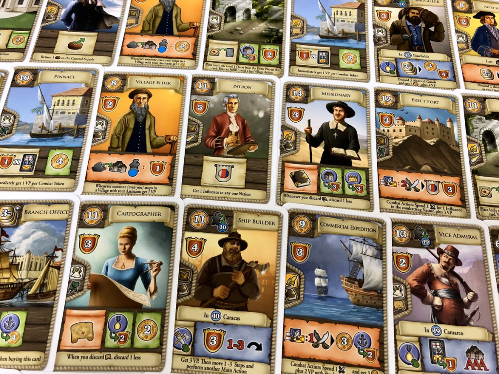
Maracaibo has many different uses for cards. Generally speaking, it uses icons for almost everything on the card. Many of these actions are very obvious and easy to learn, like how much a card costs or how many points it gives you. However, some of the effects that you can play the card for are very unique and specific. For this part, the designers added a text description of the effect. This detail saves a LOT of time looking up icons in the book, and greatly streamlines play. Note that they don’t include text for the core, most common symbols. It is all about the confusing and unique combinations of icons. Each time I play this game I am struck by how streamlined it is thanks to this redundant information.
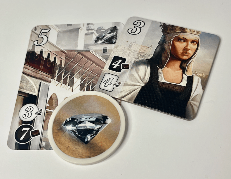
Another game that presents information in multiple ways is Splendor. The portion of these cards that indicates their costs shows both the color of the gems needed and an image of the icon. This simple detail enables players of different types to engage with the content. This is especially true for color-blind players, as we will see later in this document. It is a small detail, but it makes sure that gameplay is easy for players of all types.
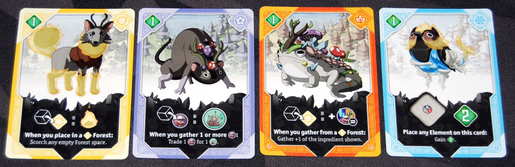
Another interesting game that uses icons plus text is Brew. This simple game has a really strong icon system, which could stand on its own. However, they added text to each card to explain it. This avoids the need for an explanation of the cards in the rules and greatly streamlines the learning and playing of the game.
Conclusion
Presenting information in different formats at the same time makes for a more inclusive and accessible player experience. Instead of requiring all players to understand information in one way, multi-format design recognizes that people think differently and offers various paths to the same understanding. This approach lightens the cognitive load for everyone; even players who prefer one format can benefit from having alternatives for confirmation and clarity. Oftentimes, the use of icons is about saving space and making cards more uniform. Adding the text back in feels like it goes against this. But the ease of play is significantly boosted and is worth considering.
