Designs that effectively connect the various components and mechanics of a game in a seamless way often feel simpler, logical, and possibly even obvious. But refining a design to that point is no simple task. The more streamlined an experience feels, the more likely it is that a lot of effort was put into making it that way. Smoothing out the exceptions, putting everything in the perfect place within the experience, and making sure it’s always clear how things connect is a serious challenge. It strikes at how the game fundamentally works, but also how it is physically and visually brought to life. Let’s review a few examples to see how this might work.
Shackleton Base


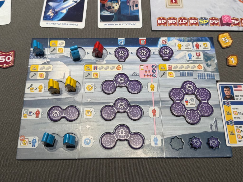
The single most important component in unifying and streamlining Shackleton Base is the player board. The player board captures a robust list of details perfectly alongside the components. The quantity of rules captured here is really impressive. It includes:
- Building cost per building type
- Required construction order (when appropriate)
- Maintenance cost per building type
- Immediate benefits for buildings
- Ongoing abilities for buildings
- Income per building
- Building limit
- Housing limit for people in the buildings
- Bonus scoring usage
- When do certain effects, benefits and rules apply (at what stage in the game)
Almost every single building on the board gets a different type of benefit, and in different ways. If that info wasn’t captured so elegantly here, the player aid would have been huge and would have had so many extra exceptions and clarifications. I encourage you to check this game out for a great example of a complex game that is made super easy thanks to well-executed iconography, physical components, and graphic design. The way these elements are woven together is truly inspiring.
Smartphone Inc.

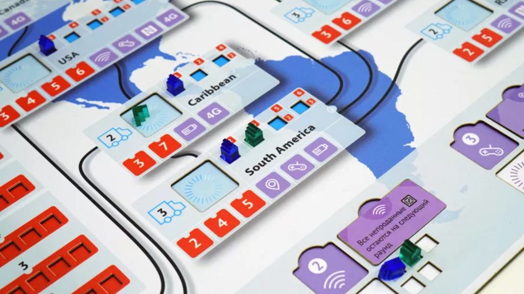
Smartphone Inc. has a lot going for it, and one way it shines is how related elements are so clearly connected. Instead of trying to cram everything into accurately sized country spaces, they created these pop-out rectangles to hold everything. This neatly collects all the things related to a country in one nice package that cannot be confused. It still has a “map” feel to it, thanks to the background. Each region has three types of things going on, and it’s nearly impossible to get them confused when playing the game.
Revive

Revive, much like Shackleton Base, hides a mountain of complexity inside its player board. One detail I want to highlight is how it shows the interaction between the three main tracks that occupy the bulk of the board. The connections created by this spiral would not be manageable without the clear flow it has. The mechanics are natural and intuitive, making the game very player-friendly.
Conclusion
Making a game that is seamlessly integrated like this requires a great deal of effort and intentional design. Playtesting is really the only way to get things to this point. And when playtesting, be on the lookout for things that trip players up—things that you could streamline through visual and physical design factors.
