When every component in a game has a clear, distinct purpose communicated through its physical design, players can understand the game’s systems through observation rather than memorization. By simply looking at a component—its shape, size, material, or visual treatment—players should be able to intuit what role it plays. Components that look different should function differently, and components that function the same should look similar. This creates a visual language where form communicates function, reducing the cognitive load of learning and playing while improving the overall player experience.
The opposite creates confusion: when functionally different components look similar, players must constantly reference rules to remember what each piece does. Well-designed games use physical differentiation strategically, ensuring that each distinct component type has a clear, singular role that players can identify visually. The goal is creating intuitive systems where physical components act as documentation, making the game’s structure observable rather than abstract.
Splendor
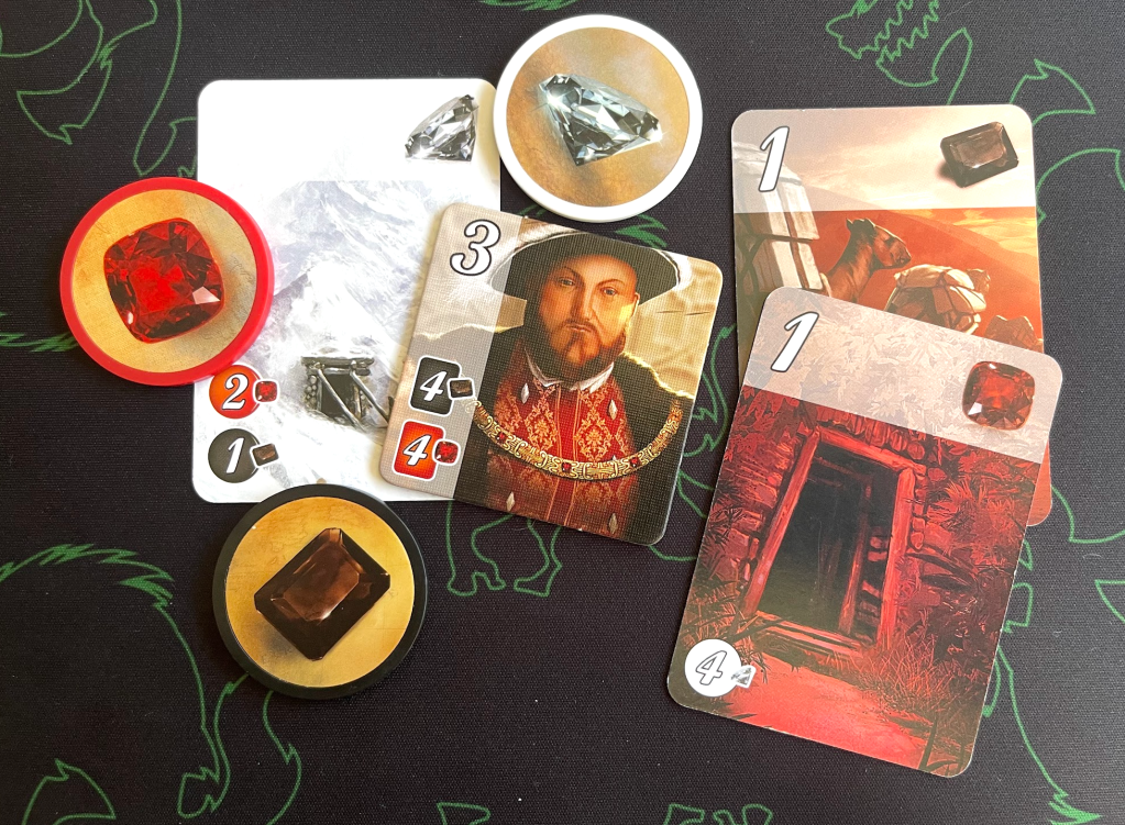
Splendor demonstrates this principle through its three physically distinct component types: poker-chip-style gem tokens, small rectangular development cards, and larger square noble tiles. Each component has a unique size, shape, and thickness that immediately communicates its function—the heavy chips feel like currency, the standard cards signal primary game elements, and the large square tiles are special objectives. The game could have used uniform cards for everything, reducing costs but sacrificing clarity. With distinct components, players immediately understand the basic structure—collect chips to buy cards to gain tiles—because the physical components create a visual hierarchy that mirrors the game’s mechanical hierarchy, making it impossible to confuse which elements serve which purposes.
Patchwork

Patchwork uses distinct component types to make its economic puzzle immediately understandable through physical form. The fabric tiles are irregularly-shaped cardboard pieces with varied dimensions, making spatial planning visually obvious. Button tokens are small, round, and coin-like, clearly communicating their currency role. The time track uses wooden pawns on a linear path, signaling progression rather than collection. By giving each system its own distinct physical form, Patchwork makes its structure—acquire fabric with buttons, position fabric spatially, advance through time—comprehensible through observation.
Santorini
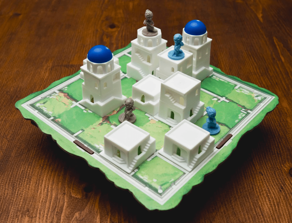
Santorini demonstrates clear component purpose through its tiered building pieces and distinct player pawns. The building levels are stackable white blocks in three graduated sizes with blue dome tops, making vertical construction progression visually obvious at a glance. Player pawns are colored miniatures clearly distinct from the white architectural pieces, while god power cards are flat rectangles. If buildings were cards or flat tokens, players would need to read numbers to understand board state, but the stackable blocks make the core mechanic—build up, climb up, win at level three—physically demonstrable. New players grasp the concept within seconds because the form communicates the function: bigger blocks are higher buildings, and you’re trying to get your pawn to the top.
Quacks of Quedlinburg

Quacks of Quedlinburg uses distinct component types to separate its two core systems: potion-making and progression. The ingredient chips are thick cardboard tokens in various colors, designed to be drawn from a bag and placed in your pot area, their substantial thickness making them easy to grab blindly. The scoring track is a separate board clearly distinct from the ingredient system, while player flasks are larger flat surfaces with circular pot outlines that hold your chips. The game could have used cards for ingredients, but the physical components make the mechanics intuitive—thick tokens feel like substantial ingredients, drawing from an opaque bag creates genuine suspense, and the circular pot outline shows exactly how ingredients accumulate. By giving each element its own distinct form—drawable tokens, scoring board, assembly flask—Quacks makes its push-your-luck mechanics observable and rules self-evident.
Conclusion
When each object in a game has a clear purpose communicated through its physical design, the game becomes easier to learn, teach, and play. Players develop an intuitive understanding of game systems because they can see and feel the differences between component types, creating natural mental models of how the game works. This principle requires thoughtful design decisions about when to create physical distinction and when to maintain visual consistency, ensuring that form follows function in meaningful ways. Games that achieve this clarity let their components do the teaching, reducing reliance on rulebooks and memory while creating more confident, engaged players who understand the game through interaction with its physical elements.
