Effective icons in board games serve as visual shortcuts that replace text with instantly recognizable symbols, reducing reading time and cognitive load during gameplay. Icons work best when they represent either familiar concepts that players already understand from broader cultural context, or frequently needed information that appears repeatedly throughout the game. When designed well, icons allow players to process game state and card abilities at a glance rather than parsing sentences, keeping gameplay flowing smoothly and minimizing interruptions to reference rulebooks or explanations.
The power of icons lies in their ability to compress information into minimal visual space while maintaining clarity. A single sword icon communicates “attack” or “combat strength” more quickly than reading those words, and when that icon appears dozens of times across multiple cards, the time savings compound significantly. However, icons only achieve this efficiency when they leverage either universally understood symbols or become familiar through repeated exposure during gameplay. Obscure or overly abstract icons create the opposite effect, forcing players to constantly translate symbols back into concepts.
The Two Categories of Effective Icons
Icons succeed in board games when they fall into one of two categories. The first category includes familiar concepts—symbols that players recognize from outside the game context. These might be cultural universals like hearts for health, coins for currency, or crossed swords for combat. But it might also include common concepts used across games like stars for points for example. Players require minimal or no explanation for these icons because they arrive at the game already knowing what the symbols mean, allowing immediate comprehension without learning overhead. Assuming of course that the game doesn’t try to fight against this and give well accepted symbols new meanings.
The second category includes frequently needed ideas—information that appears so often during gameplay that learning a symbol becomes more efficient than reading text repeatedly. Even if a resource type or action is unique to your game, representing it with a consistent icon becomes valuable when players encounter it on every turn. The initial learning investment pays off as players internalize the symbol through repeated exposure, eventually processing it as quickly as they would familiar icons.
The worst icon systems mix these categories poorly, using obscure symbols for rarely needed information. If a special ability appears on only three cards in the entire game, an icon provides little benefit over simply writing the ability in text. The learning cost of decoding the icon exceeds any efficiency gain from its use.
An additional benefit of icons is that players can be confident that when they see the symbol it always means the same thing. In contrast, if words are used there is always the chance that the text varies slightly and you might make mistakes if you assume one way or the other. In a way, using icons forces the designer to unify the actions in a game.
Wingspan – Resource and Habitat Icons

Wingspan demonstrates excellent icon design through its food resource system, which uses symbols that balance familiarity with game-specific needs. The five food types—seeds, berries, fish, rodents, and worms—each have distinct icons that appear throughout gameplay on bird cards, dice, and the player mat. While these specific resources are unique to Wingspan, their icons leverage familiar visual associations: seeds look like seeds, fish are recognizable fish shapes, and the color coding reinforces identification.
The habitat icons in Wingspan—forest, grassland, and wetland—represent frequently needed information that appears on every bird card and determines where cards can be played. These icons use intuitive visual shorthand: trees for forest, grass for grassland, water for wetland. Players encounter these symbols so frequently during card evaluation and placement that they become second nature within a few turns. The icons allow players to quickly scan their hand for birds of specific habitats without reading text labels, significantly speeding up decision-making.
Wingspan also succeeds by limiting icon complexity and maintaining visual consistency. The egg icon is a simple oval, the victory point star is immediately recognizable, and the wingspan measurement uses a standardized ruler graphic. Each icon serves a clear purpose and appears frequently enough to justify its existence. The game avoids the trap of creating icons for rare or complex abilities, instead using text when clarity requires it. This selective approach ensures that icons genuinely accelerate gameplay rather than creating a decoding challenge.
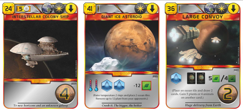
Race for the Galaxy – Action and Phase Icons
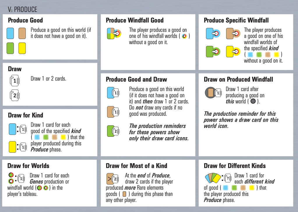
Race for the Galaxy uses icons extensively to represent game phases and card abilities, creating a visual language that initially challenges new players but rewards experienced players with very high information density. The five phase icons—explore, develop, settle, consume, and produce—appear on action cards that players select each round. While these icons require learning, they represent the most frequently needed information in the game, appearing in every single round of play. The investment in learning these symbols pays off immediately as players can identify chosen phases at a glance across the table.
The card ability icons in Race for the Galaxy compress complex rules into compact visual shorthand. A card might show a military strength icon, a resource production icon, and conditional bonuses represented through small symbolic notations. Because players constantly evaluate and compare cards throughout the game, these icons dramatically reduce the time needed to assess options. A experienced player can evaluate a hand of cards in seconds by scanning icons, whereas reading equivalent text would take significantly longer and break gameplay flow.
The game’s success with icons stems from their frequency of use. Every card uses these symbols, every round requires interpreting them, and every strategic decision depends on quickly parsing this visual information. Race for the Galaxy makes a deliberate trade-off: steeper initial learning curve in exchange for dramatically more efficient gameplay once players internalize the icon language. The game provides reference cards to support learning, acknowledging that icons representing frequently needed but game-specific concepts require educational scaffolding before they become automatic.
Terraforming Mars – Resource Production and Tag Icons
Terraforming Mars employs an extensive icon system to manage the game’s complex resource economy and card interactions. The six resource types—megacredits, steel, titanium, plants, energy, and heat—each have distinct icons that appear on production tracks, project cards, and corporation boards. These resource icons represent constantly referenced information, as players must track production, spending, and conversions every single round. The frequency with which players check resource availability and calculate costs makes visual shorthand essential for managing the game’s economic complexity without drowning in text descriptions.
The tag system in Terraforming Mars demonstrates icons used for frequently needed pattern recognition. Each project card displays tags like building, space, science, power, and Earth, represented by small icons at the top of the card. Players reference these tags continuously when evaluating card synergies, checking whether they meet card requirements, or calculating scoring bonuses. Many cards provide benefits based on tag counts—”Gain 1 megacredit for each space tag you have”—making quick visual counting of tags across your tableau a regular gameplay activity. The standardized icon placement and consistent visual design allow experienced players to scan their entire card array and count specific tags rapidly.
Terraforming Mars also uses icons to represent the three global parameters—temperature, oxygen, and ocean coverage—that appear on many cards as requirements or effects. The thermometer, oxygen symbol, and water droplet icons compress complex game state information into scannable symbols that players check dozens of times per game. The game’s complexity demands this visual efficiency; translating every icon back to text would make an already lengthy game unmanageable. While the initial learning curve is steep due to the sheer number of unique icons, the frequency of reference means players who engage with the game regularly internalize the symbol language, transforming what initially seems overwhelming into an efficient visual system that supports the game’s strategic depth.
Conclusion
Icons serve board game design effectively when they represent either familiar concepts that players already understand or frequently needed ideas that appear often enough to justify learning new symbols. The best icon systems carefully consider which information benefits from visual shorthand and which is better expressed through text, avoiding the temptation to iconify everything at the expense of clarity. By focusing icons on the information players need most often and designing symbols that either leverage existing associations or become familiar through repeated exposure, designers can create visual languages that accelerate gameplay while maintaining accessibility. The goal is not to eliminate text entirely but to use icons strategically where they genuinely improve the player experience through faster information processing and reduced cognitive load.
