The idea of accessibility is super simple; is the content able to be consumed by as wide an audience as possible. Something that can play into this in a very big way is the presentation of text. As the title of this post states, is it large, clear and high-contrast. These are the factors that make text easy to consume. In this case
A high contrast font is a typeface characterized by a pronounced difference in stroke weight, creating a clear distinction between thick and thin lines. This design approach enhances legibility, making text easier to read, especially from a distance or in poor lighting conditions. High contrast fonts are often used in signage, headings, and graphic design to attract attention and convey information effectively, as they stand out against various backgrounds.
High contrast text should have high contrast against its background to ensure maximum readability and accessibility for all users. This contrast not only enhances legibility but also improves the overall user experience by reducing eye strain.
All of these concepts are super simple, but can have a significant impact on accessibility. With a little effort you can make text easily read by the widest range of people possible.
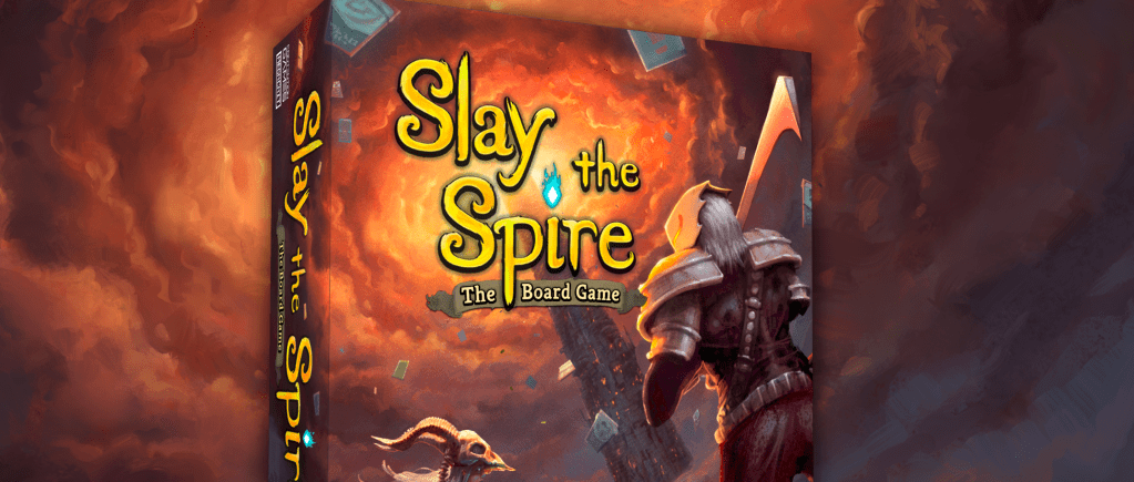
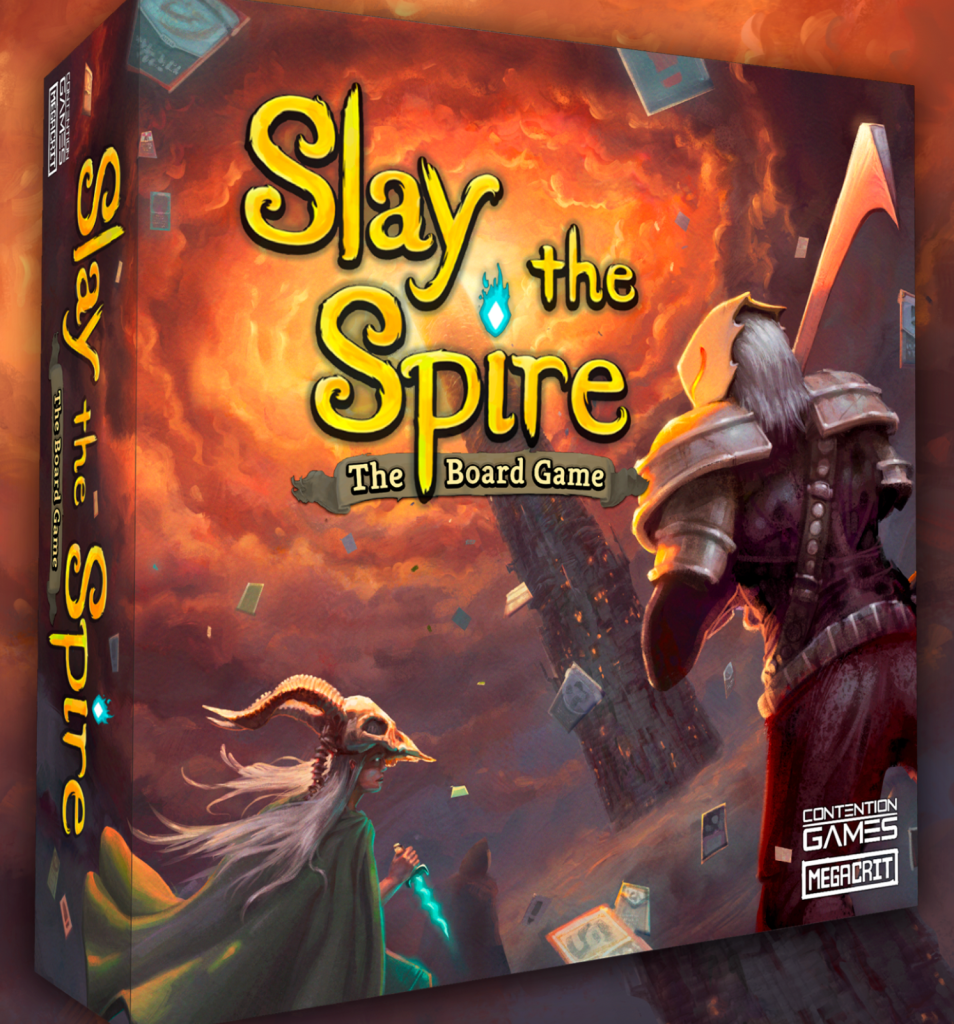
The title text on the cover of Slay the Spire The Board Game is a great example of how to do this well. In fact, once you notice a few details about the text you will spot these patterns all over. First, it uses large clear text. Yes, its a decorative font, but it works because its so large and easy to read. Second, the text has a visually complex background so they helped the text standout by giving it a border and shadow. This helps the eye visually separate the text from the image. Finally, it uses regular capitals and lowercase letters to ensure its quick and easy to read.
Next I want to highlight a few mistakes from some games that I play frequently and really enjoy…which is why I have had plenty of time to critique them over the years.
The first is from one of my all time favorite games, Champions of Midgard. The first problem here is not so much the size but rather, the over use of decorative fonts. Decorative fonts, are just that, meant for decoration. When text is presented very large, and as a title, a decorative font can make sense. But as you can see in the image below, a “rune” font has been used on all the text. It is all caps and very thematic. The problem is that this makes it considerably more challenging to read. Even those with perfect eye sight will read this text slower. There is simply no reason to do this. This text makes the game less accessible.

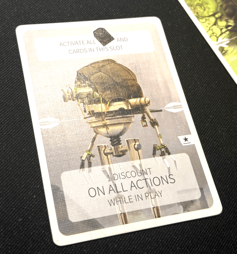
Revive is another game I have been playing a lot recently. Some of the cards use text instead of icons. That text is all caps and uses a super thin font as you can see in the image below. The cards with icons can easily be viewed from across the table, even with my poor eyesight. However, these cards with text are super hard to read even when they are in front of you. Again, there is simply no reason for this. A higher contrast font would have been a much better choice. Also, do away with the all caps!
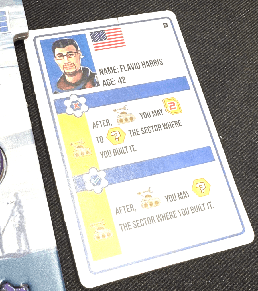
Finally I want to look at these cards from Shackleton Base. Once again we see all caps text. The font choice is actually pretty good. And ironically I am sure it’s not an all cap font. So they could have easily made these with regular text. The end result is a card thats just a bit harder to read for no reason at all.
It can be super tempting to make text all caps because it looks a little cleaner. But studies have shown that all cap text is simply harder to read and is therefore less accessible. Make text large, free of background distractions and high-contrast; it’s really that simple.
