
Chunking in design refers to the strategy of breaking down complex information into smaller, manageable units or “chunks” to enhance user understanding and retention. By organizing content into chunks, designers can create a more navigable and digestible experience, making it easier for users to process information efficiently. This principle is particularly effective in visual design, where grouping related elements and employing clear hierarchies can guide users’ attention and streamline interactions. Ultimately, chunking helps improve usability and fosters better engagement with the material presented.
For a simple example of chunking, phone numbers are a great example. Consider the famous phone number (204) 867-5309. See how it is “chunked” into three parts. This makes it far easier for the brain to memorize it. Incidentally, it’s also a lot easier to read. Compare this to if the number was written as 2048675309. Perhaps you never considered why a phone number is written like this. It’s a simple usability trick that makes memorization and reading vastly easier. Consider the simple comma in numbers: Consider 1,000,000 vs 1000000. In the first one, it’s obvious it’s a million. In the second number, you definitely have to focus on it for a second to process it. This concept can be found at work in game designs in many ways.
Chunking on Cards
One of the most obvious places you will find chunking is on playing cards in games. In this first example from Marvel Champions, the chunking just feels natural; it’s easy to think it was by accident. The card has 4 main regions. The first and simplest is the title at the top. Then we have a large space for artwork. Next, there is a large container at the bottom with various pieces of information grouped into one large space. Finally, we have the 3 key stats grouped on the left of the card. This chunking reduces the visual complexity of the cards and makes them much easier to scan.

Another game with cards that follow a similar formula is Unmatched. Here there are 3 regions. The artwork is its own region and is mostly decorative, though it does have a function. Players can quickly recall what a card does by looking at the art. After you have played a character a little, you start to use the art as a rapid identification of the card. Next up is the large region at the bottom. Note how 4 pieces of information are grouped into this singular chunk, and within this chunk is a hierarchy of content. Finally, we have the elements in the top left. It might have been tempting for the designer to fill all 4 corners with content; instead, they used chunking to reduce the visual clutter and make the information far easier to process. This is perhaps one of my favorite card layout formulas.

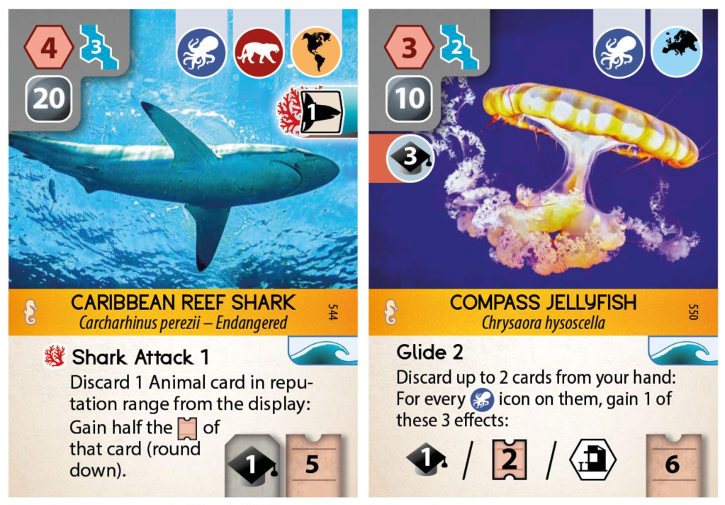
Ark Nova is a card-driven game with a lot going on. Looking at the cards below, it’s a lot to take in. These cards have costs to play, extra effects when played, ongoing benefits, instant benefits, scoring aspects, and so much more. It is a LOT to pack in. In my opinion, there is chunking going on here, and it definitely helps the cards to be readable, but it is not perfect.
In stark contrast to Ark Nova, the cards in Hero Realms are relatively simple. In this case, they did in fact push content into 3 of the 4 corners. Normally, I would have liked to see the top two corners consolidated into a single space, but they serve different roles. The top right is the cost when the card is being purchased. The top left is the alignment of the card, and the bottom right is the amount of damage it can take while it’s in play. Each of the 3 corners is used at a different time. So in this case, not chunking those items together was actually logical. Note in contrast though how all the main contents of the card are contained on the single scroll space. This creates a chunk that is applied at a given time. The morale of this story is don’t just try to make random chunks. Those chunks should contain content that is closely related and needs to be referenced in unison. Doing so reduces the visual complexity, but only when it’s needed.

Chunking on Game Boards
Another place we can frequently find chunking is on game boards. In this first example, Endeavor: Age of Sail, the map is clearly divided into 7 regions. Players have to unlock access to each of these regions. It is greatly appreciated that each section is so clearly defined. It might have been tempting to try and make it look like one map. Instead, they have chunked it into 7 regions that are easy to discern. It’s such a simple demonstration of the idea, and it clearly improves the usability of the game.

Reavers of Midgard does a similar thing with its board. Each of the regions is contained within a colored section. This chunking allows you to scan the five action options at a high level. Then, once you pick one, all you have to focus on is the stuff in that area. This is exactly the purpose of chunking. It enables you to process a much larger amount of information by only focusing on the level and areas you need to.

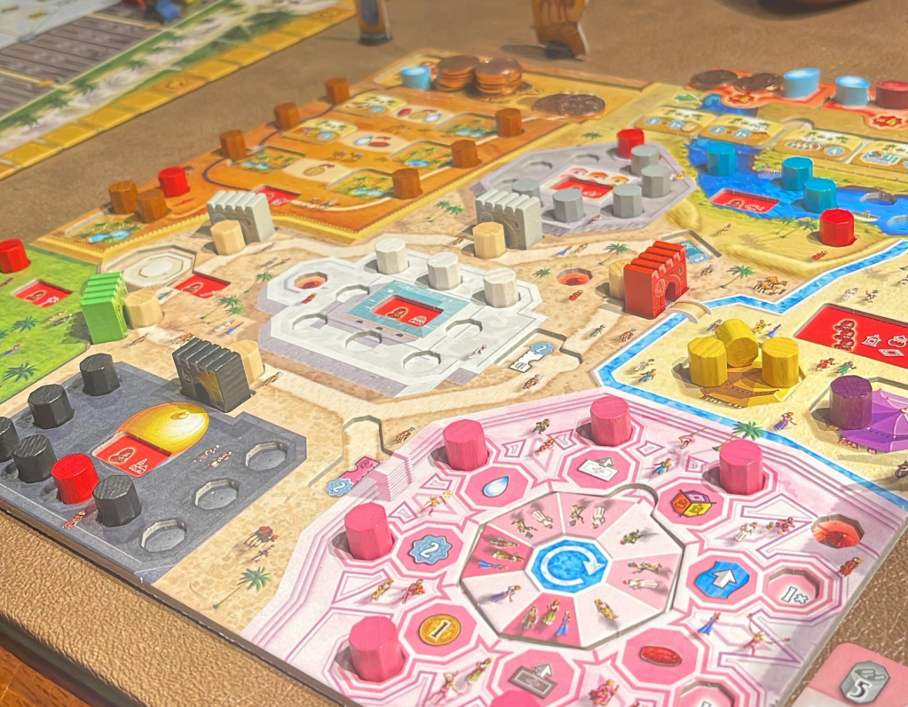
Another example of a board that uses color as a chunking tool is Marrakesh. Each player’s board is a rather complex set of information and abilities. Using color, each section is clearly separated. Add to this that the tokens you acquire are color-coded to those sections. This makes the game considerably easier to play and understand. It’s a rather complex game, so this visual aid is an excellent way to reduce that mental load.
Some games, due to their mechanics, are harder to apply the principle of chunking. Consider the game Caverna. The game is made up of a very large grid of actions presented on playing cards. While the individual cards make use of chunking, as a whole they do not. Players are presented with a very wide array of actions to pick from. Fortunately, the game makes use of strong iconography, and the effects of each location are relatively easy to figure out. However, at the beginning of the game, when you are new to the system, it can be very overwhelming. There really isn’t any aspect that creates clusters of cards you can consider as a group. This isn’t necessarily a fatal flaw. Part of the reason this works is that this is the primary point of complication in the game. Player boards are relatively simple and don’t require much consideration. The point is that you’re only trying to process this one area of the game. Everything else is super simple. I think this is a very important consideration as we design games. Where is the complexity? In how many places are we creating a lot of complexity? Is the player able to chunk those regions to reduce the complexity? Answering and thinking about these questions will lead to smoother gameplay and a better player experience.

Another game with a huge array of cards to process is Xenoshyft. It can be lot to take in when looking at the huge market of cards. While the game doesn’t have a visual method for chunking at this level, it does have one. In the first 3 rounds when you buy cards, you can only buy from the first row. This means you can look ahead to what will be available, but you don’t have to. And taking in 1/3 of the market isn’t that bad. The neat thing is that after you play 3 rounds with the first row, you move on to including the second row. In this way, the game slowly introduces you to the custom set of equipment you have available.

Istanbul is such a great game, but it does struggle with chunking. If you play the big box version, the market can contain up to 25 different action spaces. That is a tremendous amount of action options to keep in mind. Much like Caverna, the spaces themselves do use chunking effectively, but when seen as a whole, there is zero chunking. There are a few common ways things work, but they are not visually grouped, so it’s hard to think of them in chunks. I think the saving grace for this game is that players don’t have much of a player board to manage. Each player’s board is really about holding the resources they have collected. So there isn’t much to think about. The entire game takes place on the grid of actions. Some players will randomly wander the board and won’t likely win. Others pick out a set of buildings that they will repeatedly use and try to speed their way to the ending. It’s interesting to see how the real game here is spotting opportunities in the market due to the location of the cards.

Conclusion
So how do you achieve this? Well, it’s actually relatively simple. Let’s consider a card design as an example. Instead of just pushing the elements of a card to the four corners, find intelligent ways to group the information based on how it’s related. So instead of four corners, plus art and a section for an effect, you group those things to make 2-4 clusters instead of 6 separate areas. It’s all about creating groups that will enable the player to engage with or ignore multiple things at a time.
