
White space, also known as negative space, refers to the areas in graphic design that are left unmarked or free of text and images. It plays a crucial role in creating balance, improving readability, and enhancing the overall aesthetic appeal of a design.
Effective use of white space in graphic design significantly enhances board game design and player experience by promoting clarity and focus. It allows players to navigate game components easily, preventing visual clutter that can lead to confusion.
White space as aesthetic
In a small segment of games, the extreme usage of white space becomes the focus of the visual style. This isn’t the only way to use white space, but it’s a great way to focus on it to see how it can be used.
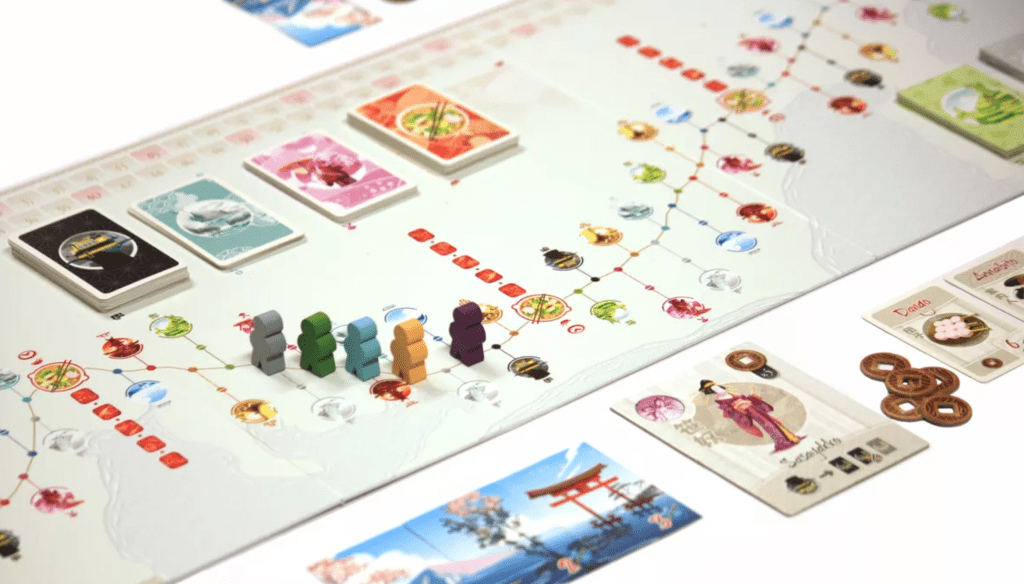
Here, on the cover for Tokaido, we see a shining example of white space as the primary aesthetic in the design. In many ways, this transforms the cover into what feels like a work of art. The abundance of white space leaves you to focus on the central art piece. The result is rather distinct and beautiful.

Here you can see that the strong use of white space is carried through the design. It definitely enables the colors and other elements to really pop in the design. Again, the overall aesthetic is so pure and clean.
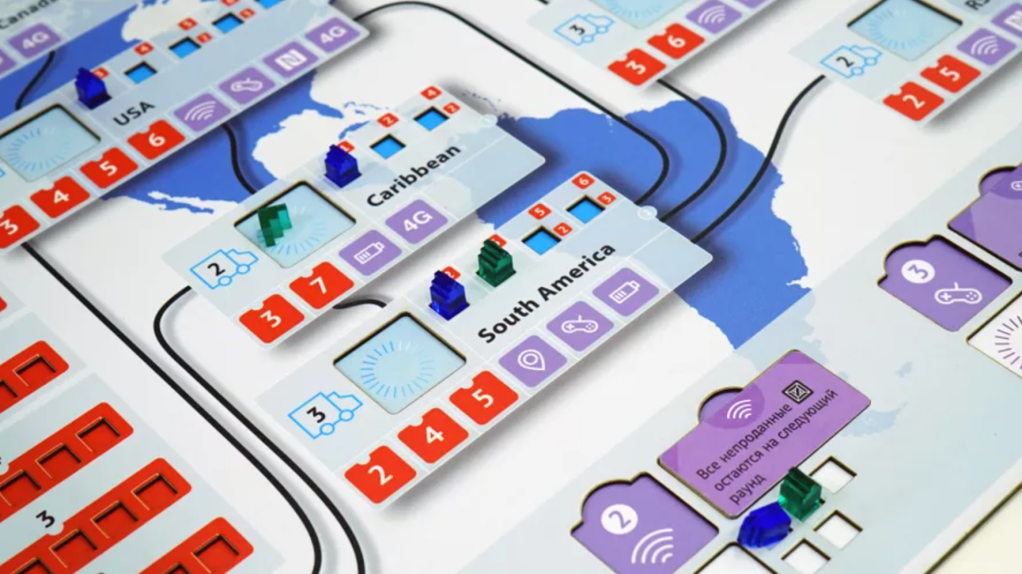
Another game where we see a design very driven by abundant use of white space is Smartphone Inc.. A super busy background map of the world would have potentially made it very difficult to read the connecting lines. Plus, this super clean and sharp approach feels more at home with the theme of smartphones. It’s a clever design style that is, in this case, also more usable.
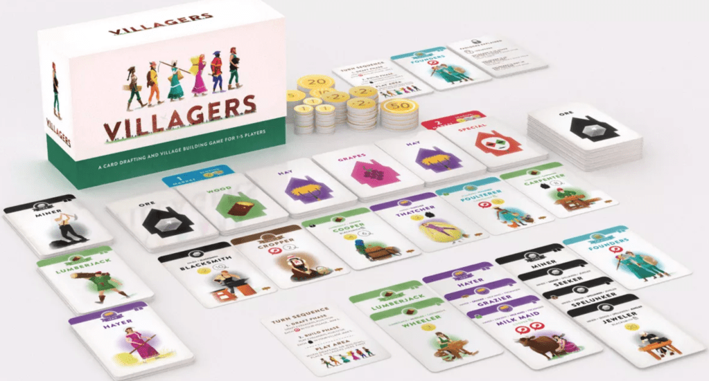
Villagers also uses the white aesthetic. It’s neat to see how this has emphasized the art and the icons in the game. This clean style really lends itself to a favorable experience.
Another example which is interesting to consider is Cards Against Humanity. This game seems to be a controversial one, but the visual style is remarkable. The pure black and white approach with large clean type makes the gameplay super easy. This sleek minimalist style has been borrowed by several other games. Like the game or not, it makes gameplay very easy and obvious.

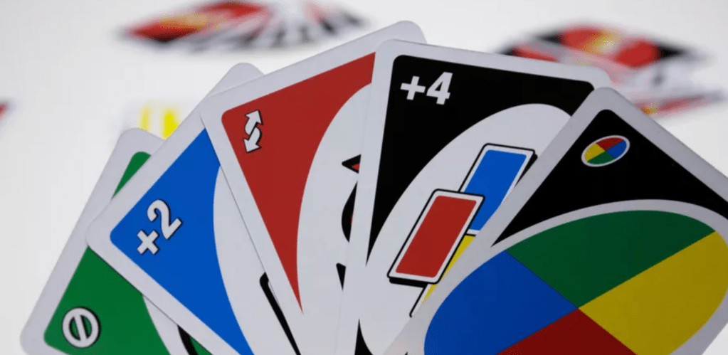
Seeing Cards Against Humanity makes me look again at a game like Uno. I wouldn’t say the design of Uno uses white space in such an extreme way, but I do see now that its minimalistic style really allows the core function of every card to shine. The visual design is perfect and leaves no confusion about the function of each card. I do think that the style plays a large part in this.
Non white, white space
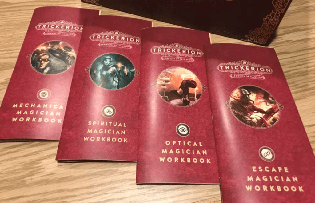
Some games make use of the concept of white space, but with a non-white color. In reality, this is probably a more likely approach to use. Trickerion is one such example. It’s not true of the whole game, but you can see this approach in the player workbooks. The sparse design uses a subtle background to ensure the contents of the design stand out. They are beautifully designed and serve their function well.
The package design for The 7th Continent demonstrates this idea well. Clearly, it is using black/gray in place of white space, but the effect is the same. In this case, the symbol on the cover takes on a sort of art piece feel. This kind of design works well when a company is selling via crowdfunding or directly to customers. The box can take on a role as more of a work of art than a sales element. As an indie game designer who sells via The Game Crafter, this is my approach to most of the boxes I create. I simply want it to be beautiful, and this is a way to accomplish that.

In the game Unmatched, we find card designs that are really close to using non-white white space. The minimalistic designs combined with solid colors and clean borders create a wonderfully usable and beautiful design. The artwork of the cards is allowed to shine, but it does not interfere at all with the information that needs to be conveyed. The use of white space in the design is not excessive and could even be considered minimal. However, it has a huge impact on how clean and functional the cards are. If I needed to copy a design style for cards, this would be the template I would want to borrow.
White space in rules
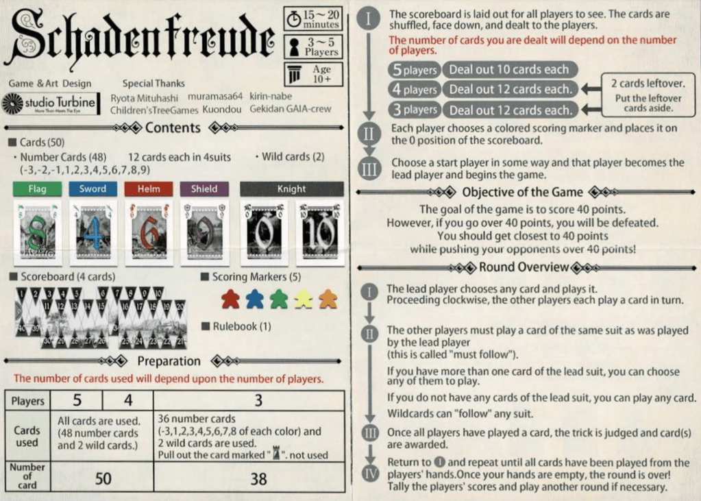
One place where the use of white space shows up in a vivid way is the rule book. The game Schadenfreude is a tiny little card game, so it’s not surprising that the rules are also super small to fit the box. That said, the rules have very little white space. In fact, everything feels super cramped and cluttered. I know they had to deal with a small amount of space. But the result is that the design feels a bit more messy and less polished, and does hinder the usability slightly. It’s not that bad, but I wanted to start with a weaker sample and progress to more extensive use of white space.
Anachrony is a really complicated game with a lot of moving parts. It should come as no surprise that the rulebook is dense and very content-heavy. That said, you can see that things have a little more room to “breathe.” The pages are definitely full, but there is just a bit more room around things so that it feels more polished.
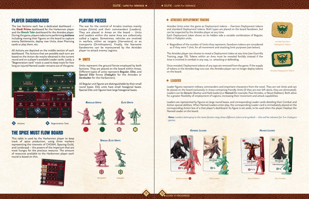
The rules for Dune: War for Arrakis have even more whitespace than Anachrony. The spacing definitely makes the content feel cleaner, more beautiful, and slightly easier to consume. This isn’t a quick little rule book either, and I am sure the design style probably made the book slightly longer. But the end result is really a fantastic balance of fitting in all the content and doing so in a beautiful way. And whitespace is one of the key elements of the formula.
Finally, let’s look at the rule book for Smartphone Inc., where we see what I might call an extreme usage of white space. The rule book is perhaps one of the easiest to use and most beautiful I have encountered. But even saying that, it feels unrealistic to expect people to take such an extreme approach. Even still, it’s great to see just how beautiful a design can be by simply using white space liberally and effectively.
Conclusion
White space is often a very underrated aspect of design. It can be really tempting to just fill all the space and pack everything in. But white space makes it easier to see and process the information in a design. It allows individual blocks to stand alone and lets the user navigate the content more easily. It can take a while to “see” how to use white space, but starting by simply considering it a useful tool is the first step.
