In graphic design, the principle of contrast plays a crucial role in creating visual interest and guiding viewers’ attention effectively; it involves the deliberate use of opposing elements such as colors, shapes, sizes, and typography. By strategically using contrast, designers can draw emphasis to specific features, create a clear hierarchy, and facilitate better communication of messages. Whether through the stark difference of light and dark hues or the playful clash of bold and subtle patterns, contrast serves as a powerful tool that not only captures the eye but also evokes emotions and conveys messages, making the overall design more impactful and memorable.
In board game design, the principle of contrast is essential for creating visually engaging and easily usable components. By utilizing contrasting colors, such as pairing dark and light shades, designers can highlight important information on game boards and pieces, making it easier for players to distinguish between different elements at a glance. This can include contrasting the background color of the board with the colors of player pieces or using bold typography against more muted backgrounds for readability. Ultimately, effective use of contrast not only improves aesthetic appeal but also aids in the functionality of the game, ensuring an enjoyable player experience.
Contrast of Color
When picking colors to use in your design, it’s important to consider how those colors will contrast with each other. Note in the image below how much harder it is to read the low-contrast text. Sometimes this is okay or even desired. For example, maybe cards in your game have a number assigned to each, so you can look them up in a book for extra explanations. Those numbers might need a lower contrast to help them disappear into the design until they are needed. Compare this to the main text of a card, where high-contrasting colors are more desirable to ensure the text can be easily read.

Notice in the box covers shown here that the text is strategically placed over a clean, almost solid color region of some type. This ensures the title of the game has consistent contrast with the otherwise very busy backgrounds. You will notice that many games have very graphic covers, and the titles are typically placed strategically to ensure they have proper contrast with the background.


Contrast of Size
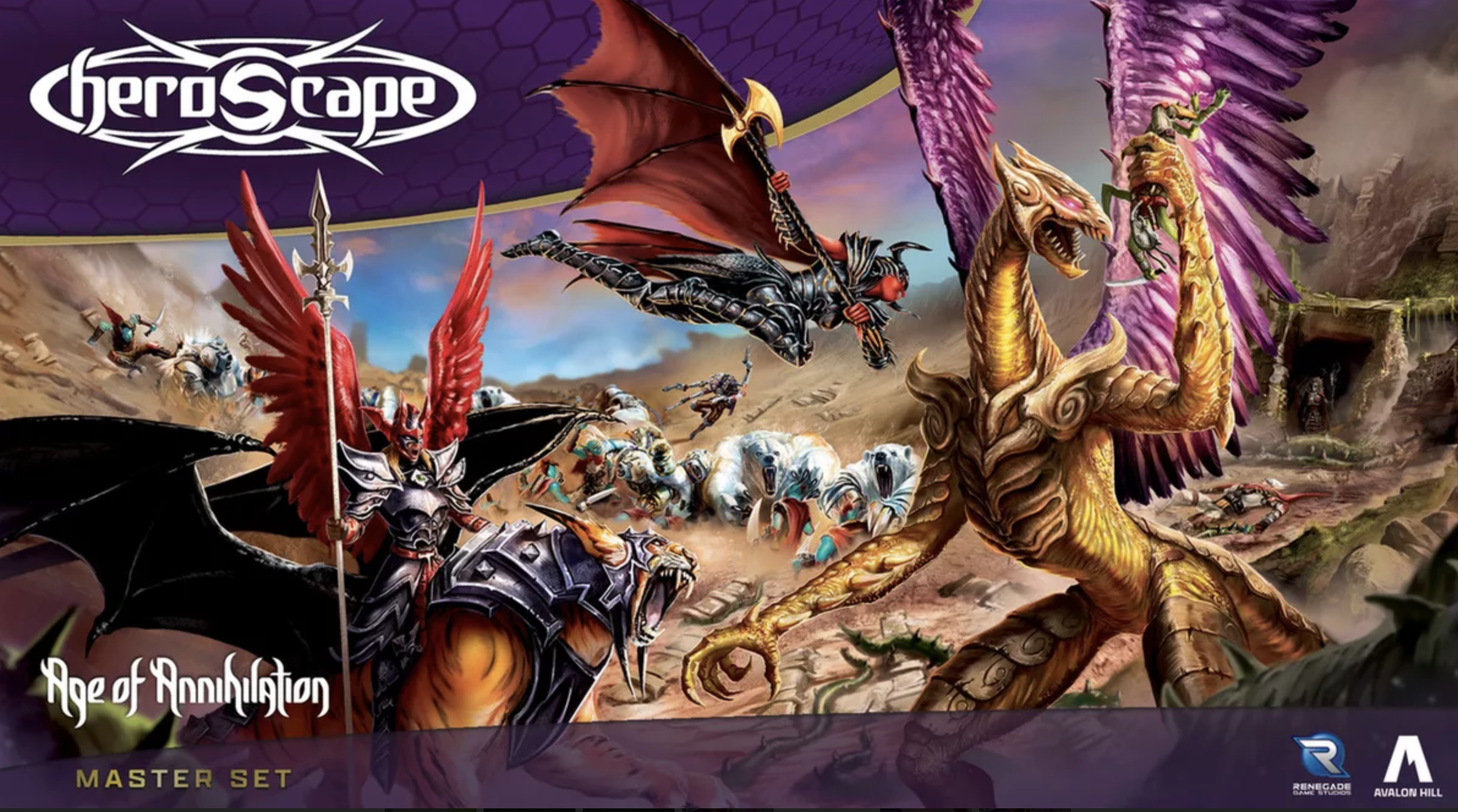
Contrast can also be achieved with size. The simple example shown here illustrates how a single small element can actually stand out. Contrast is an interesting tool that can be used in many ways. Typically, contrast of size is used to give levels of importance to content.

Notice in the sample box covers here how scale has been used with the title of each game. On the Heroscape box, the logo is small and doesn’t stick out as the first thing you see. Instead, you notice the huge image. The creators knew that the amazing figures would capture your attention, and they were smart to have it so large. Also, notice how the publishers’ logos use scale to give them a very unimportant status in the design. Overall, notice how each of these three designs uses scale differently to emphasize things within the design.

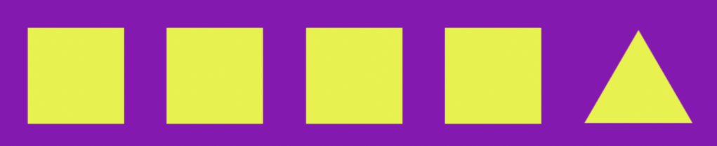
Contrast of Shape
Next up is the contrast of shape. In the sample here, the single triangle sticks out. Again, this contrast can be used to emphasize or deemphasize specific elements of the design.

The box for Azul is an interesting example. The box has lots of geometric shapes contained in clean squares. In contrast to this, the logo is contained in a shape that is very far from a square. This breaking of the pattern, and overlaying it all on top of the squares, helps the title of the game leap out of the design.

Contrast of Typography
Finally, we have contrast in typography. In this first example, you can see that the text has very low contrast to each other. The second one is slightly smaller, but it almost feels like a mistake somehow. This is what happens when contrast is low; it doesn’t always look intentional.

Contrast that with this example, where the two text samples have extreme contrast. In this case, it’s actually the same font; it’s just a different weight that has been used. In this case, the two bits of text look at home together, and yet they create a clear hierarchy of importance.

The cover for Hero Quest is a nice demonstration of this concept. Note that the title is huge, with all kinds of visual effects. Paired with this is a very clean subtext that describes the game. The two are in extreme contrast to each other.

Bring it together
As you design, carefully think about the many types of contrast you can put to work. Oftentimes, the best designs make use of multiple types of contrast. The real trick is to know when to unify things with consistency and when to create diversity with contrast.
