A major consideration of UX work is whether something is understandable. That is, can users understand the system and the way it works? A key aspect of this is the consistency of labels, elements, and actions throughout that system. When we apply this to the world of board games, it’s pretty much the exact same need. The more consistent the labels, elements, and actions are, the easier it will be to play the game. Make these things inconsistent, and it will just make the game more frustrating to play. Naturally, we would like to avoid this kind of negative player experience.
What is understandable?
In the context of UX (User Experience), “understandable” means that a product, website, or application is designed in a way that users can easily comprehend its functions, navigation, and information presented, without needing excessive explanation or effort to figure it out; essentially, it refers to the clarity and intuitiveness of the user interface, allowing users to easily grasp how to interact with it and achieve their goals. In the context of board games we can summarize it by saying that its an indication of how easily a player can comprehend the game and its parts.
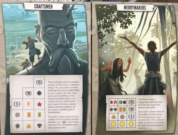
Instead of looking at lots of examples that demonstrate consistency, I want to focus on a few. In this way, we can see how they are consistent across numerous aspects of the game.
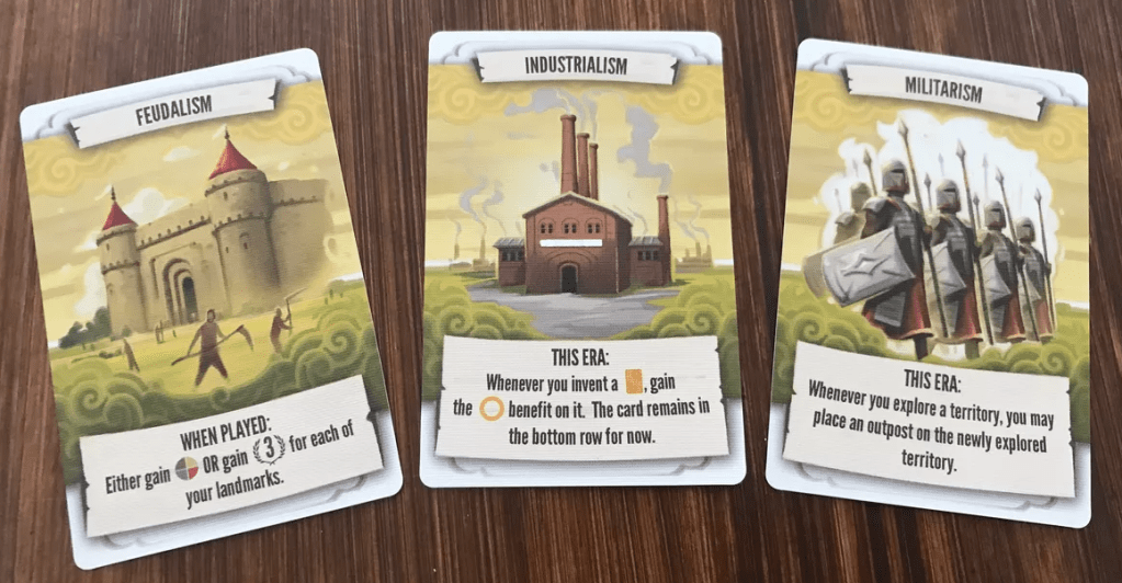
Tapestry is a civilization game that can best be described as a game of tracks. There are 4 main tracks on the board (plus a 5th side one if you have the expansion content). Players’ boards present additional tracks to progress on. Core to the game is the iconography. Once you know how the icon system works, you can interpret almost anything you see in the game. Most importantly, for the topic at hand, you can see across a huge array of components how consistent the design is.
Tapestry
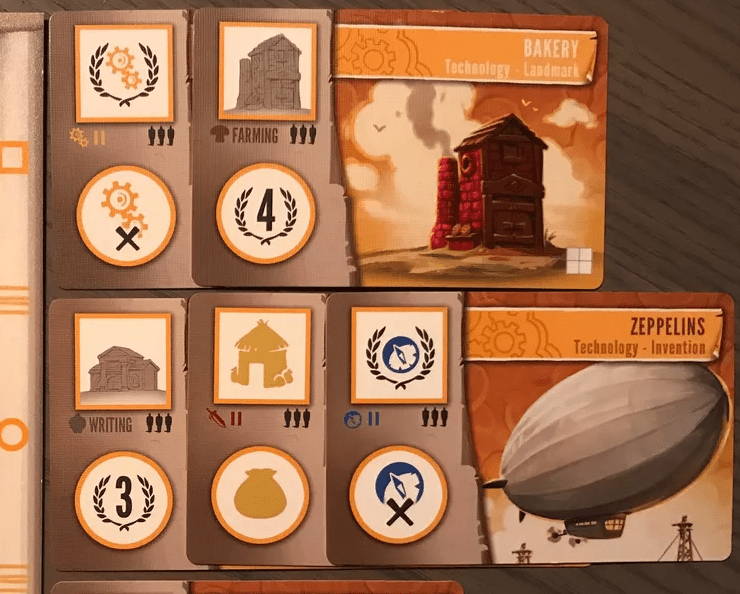
In the images below you will see the exact same icons spread across numerous components.
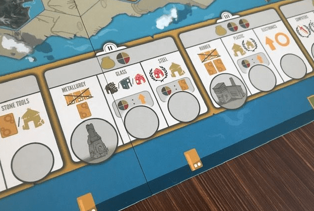
Not only do the icons on the player board match those throughout the game, but the components used to track the resources share the same shape.
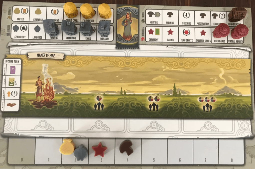

Notice that the cards have the icons embedded in the sentences. The powers on the cards are all unique, so having icons for all of them is unreasonable. However, most of these powers interact with the components of the game, which do have icons. So, it blends text with the icons to make them easier to read and resolve.
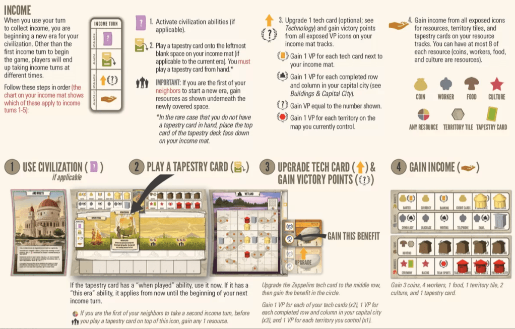
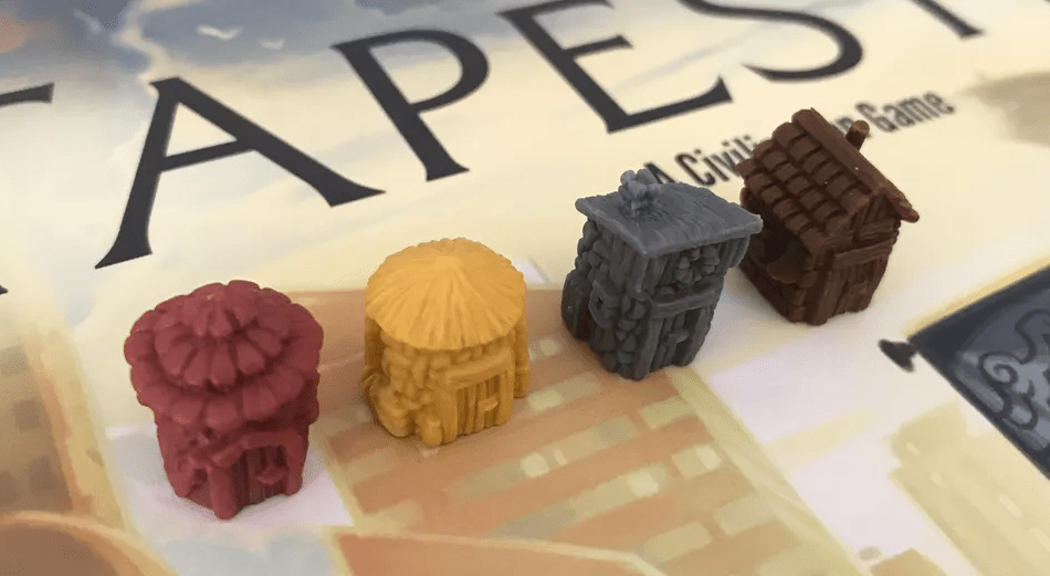
The image below shows the actual components. They match both the color and shape of the icons that reference them. The level of consistency is so well done, and it makes for a great player experience.
Playing a game like this, it’s easy to take for granted that everything matches up. When things feel “right,” it can be tempting to think that it’s easy. But consistency like this takes a concentrated effort and a dedication to ensuring that gameplay is smooth and satisfying.
Hero Realms

In contrast to the scale of Tapestry, we can look to a smaller game like Hero Realms. Despite its small size, the game is a shining example of consistency. The first image here is from the rules for the game; it clearly calls out what each section is. This is 100% carried out on all the cards. I know it seems so obvious, but defining a system and working within it requires effort.
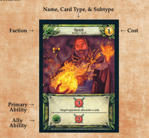
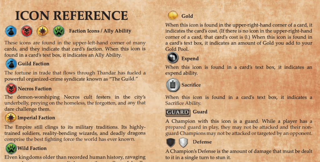
Something to note, which is similar to Tapestry, is that they had to decide what was going to be an icon (like a basic attack effect) and what would be text (like drawing a card). It’s interesting to consider what drove these choices. The iconography and its consistent execution definitely make for a great player experience.
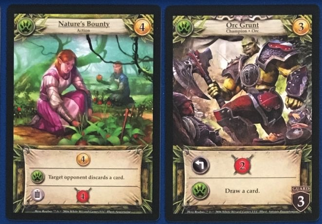
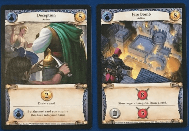
The icon reference and the labels it provides are used throughout the game. This makes the language on the cards super easy to interpret, with very little room to make mistakes.
Dune: War for Arrakis
Next I want to focus on just a single term used within a game. In this case, I am looking at Dune: War for Arrakis. We will focus our attention on just the term “unit.” It has a special meaning in the game, and it’s executed throughout very well. The first time we encounter this in the rules is when it’s introducing the components. We immediately see there are “leaders” and “units.” At this point, the weight of the term “unit” hasn’t hit home. But it’s there as a reference, which new players will no doubt return to double-check. Note that leaders are in a brighter red than the units. This is a crucial detail that makes the game much easier to understand.
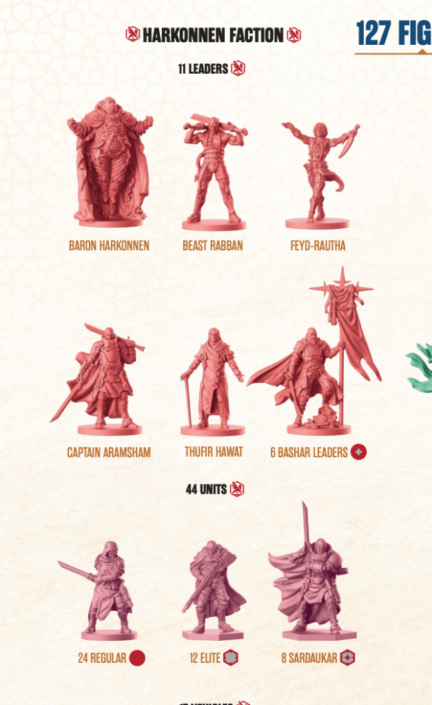
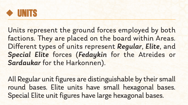
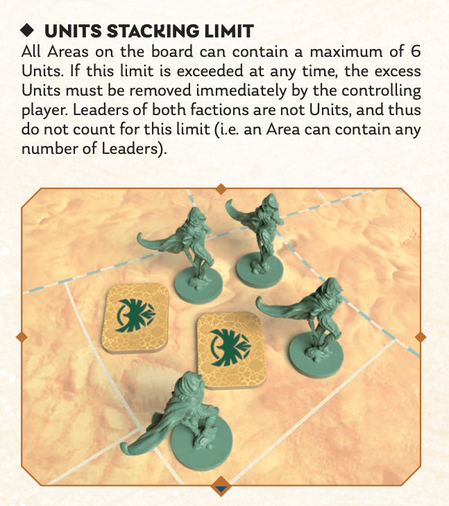
When the rules get to the section on units, we get a full description. Units represent a group of soldiers, which is in stark contrast to a leader figure that represents a single person. Here, it also spells out what the different symbols for the three unit types are (circles and hexagons). Interestingly, these match the bases of the figures.
As the rules continue, we can see that the term “unit” is well used and specifically references its definition of “unit.” It could have been tempting to use it as a general term for all figures, but they avoided this.
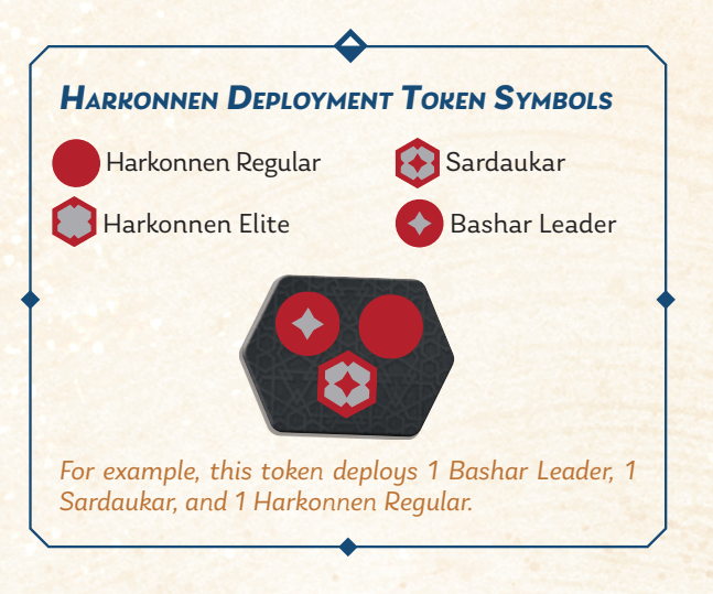
The game has random deployment tokens, and the same symbols are used there. The only nuance I wish they had included is shading the red and green differently to reflect the troop type (leader vs unit). Even still, we can see the symbolism and label for these consistently carried out.
Finally, we see an explanation of one of the actions in the game. Again, we see the term “units” used correctly.
Consider how the consistency here builds trust with the player. The player can be confident that when a special effect on a card says “unit,” we know exactly what it’s referring to. The trust has been earned through consistency alone. The game has a lot of rules to learn, but it’s great to see how the designers have removed some easy obstacles and have made the game much more enjoyable as a result.
Eclipse: Second Dawn for the Galaxy
Finally, I want to look at Eclipse: Second Dawn for the Galaxy. In particular, I want to consider the way actions are presented in this game and how consistent they are, since this is one of the criteria of this metric in regard to player experience.

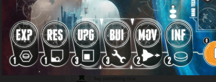
In the rule book, it introduces the 6 core actions that make up the game. In a game with so many parts and mechanics, it’s amazing that they distilled it down to just 6 actions you can take. Even better, they show them all in the book in the exact way they are used on the player boards. Also note the icon that goes along with it; these are a little reminder of which component you get to interact with. This simplification of actions, along with consistent execution, makes the game much easier to play.

When the rulebook gets to explaining each of these actions, they leverage the same 3-letter abbreviations, show them in the same order, and use the same icons along with them. It’s done just right to make the player experience positive and the game easier to learn.
The player board has these same elements, in the same order. Players move their action tokens to these spots each turn. It’s such an elegant action-selection system.
Consistency takes work
The reality is that consistency takes work. But it’s worth it! Ensuring your game is understandable is key to a positive experience. And key to this is consistency.
