When it comes to thinking about player experience and how it intersects with UX practices, icons are a key topic. In UX, icons help users to more rapidly accomplish tasks by helping them quickly identify and understand functions. In board games, this is very similar. In a game, icons can be much faster to process than words, allowing players to focus on the fun parts of the game. Icons can also force a game designer to normalize the effects in their game around a fixed library of icons. This can be a good way to reduce complexity and speed up a game. Though some designers just add more icons instead!
The metric we are considering is how icons in games can carry meaning both individually and as groups, and whether players can easily figure out what those things are.
Over the years, many different perspectives on icons have been written. But since we are only interested in the world of board games and player experience, we will skip the history lesson. Before we dive in, let’s consider the difference between icons and symbols in the context of games.
Icons & symbols
For the sake of this article, we will consider symbols as part of the umbrella of icons. But let’s start with what an icon is. An icon is a simplified representation of something that it literally represents in a meaningful way. For example, an icon of a card is a literal representation. In contrast, a symbol is a subset of icons where the image is either abstract or not a direct representation. For example, a symbol of a trophy is frequently used to represent points. Points don’t “look” like anything. So the trophy is an abstract representation, even though it has a concrete mapping to the real world.
Finally, it’s possible that an image is both a symbol and an icon! Take, for example, a simplified image of a lightbulb. It’s an icon in that light bulbs are real things. But it’s also a symbol in that it could represent an idea.
This might feel like unnecessary details, but it really is helpful to keep in mind. As we go through a number of samples, it’s helpful to think about when you’re looking at a symbol or an icon. In general, symbols are harder to create. For example, what symbol or icon would you use to represent winning a trick in a trick-taking game? There is no specific image that would show what that looks like, so it’s probably going to be a symbol, and the meaning might be hard to interpret.
What is iconography?
Iconography is the use of visuals that represent specific actions or objects. Typically this goes beyond one image to include a system of images that hold close connections and meaning with audience members. In games icons should serve as short cuts that help players to more rapidly identify elements of a game and their purpose.
For the sake of this post, I have created an assortment of categories to help us think about how icons can be used in a variety of ways. Icons are so commonly used that it would have been easy to collect hundreds of examples.
Small pointers
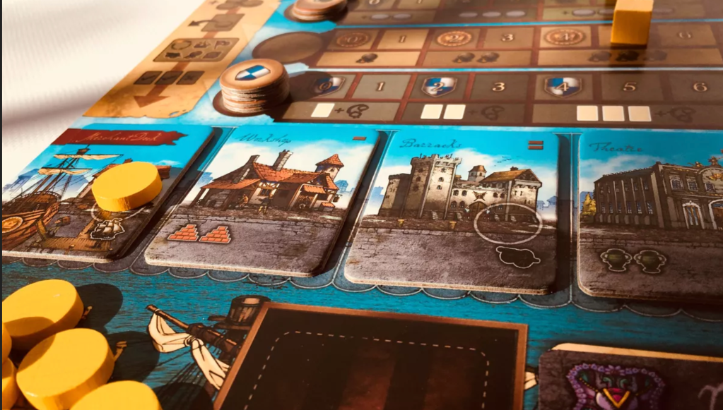
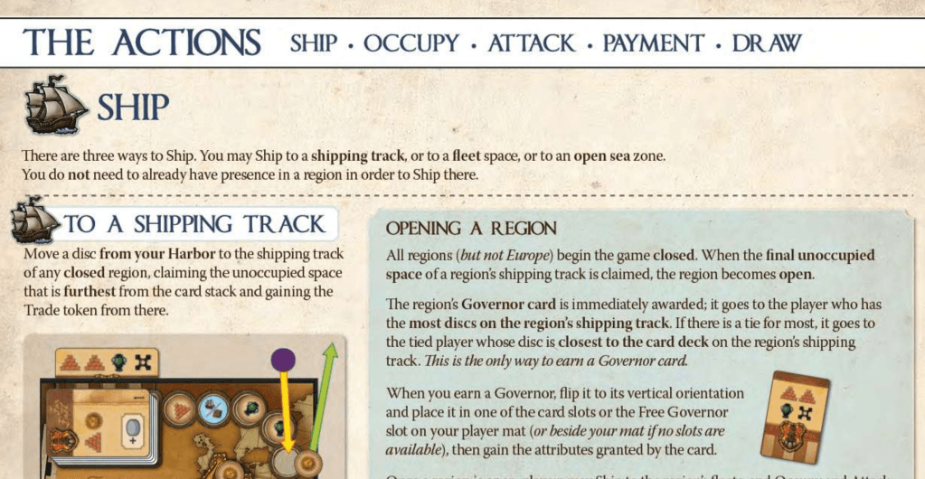
The first, and probably simplest, category I want to consider is when icons are simply used as a pointer to a topic or action. In the game Endeavor: Age of Sail, the designers have used icons in two distinctly different ways. First, they have simple icons that tell you to move up your marker on that track. So the building in the example below has you move up 2 spaces on the brick track. At any point, you can add up how many brick icons you have to see where you should be on the track. Secondly, they have icons like a ship or a cannon, five in total. These five icons point to the 5 actions you can take in the game. In this way, these icons become almost like a keyword. Using a given one of these will put into effect a chain of rules and steps to resolve it.
Another game that uses icons in an extremely simple fashion is Era: Medieval Age. Most of the icons on the dice simply grant you that number of the given resource. Some are tracked on your player board; others are temporary and only applied during conflict, etc. Given the number of dice to resolve, it’s excellent that the meaning behind the dice is so simple. If it were super complex, it would definitely be hard to choose what to reroll and what to keep.
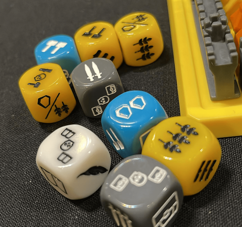
In the most basic sense, these super simple icons embody the exact purpose of icons. They are quick to be understood, their meaning is clear, and as a group, we can easily understand what they are saying. These games have a strong player experience in large part due to the elegance of the icons and symbols being used.
Icons as language
In some games, the icons become almost a special language, used as an anchor for everything in the game. Smartphone Inc. is one such game. In the first image below, you can see the 8 steps in a round. Each is identified by an icon. Those icons are then used on the player boards, where players will pick their actions. There is a perfect mapping in that the number of symbols you have of each type is how powerful that step of the round will be for you. For example, blue boxes with trucks become your ability to spread across the map. These symbols are carried throughout the entire game and unify it so elegantly. The icons create a very satisfying player experience and are the core feature of the game.

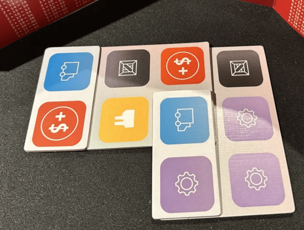
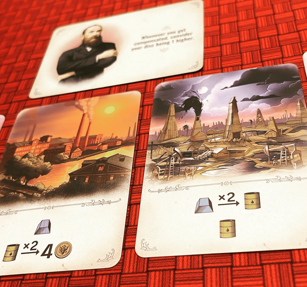
Some games use icons and symbols almost as a sentence structure, taking on a more literal language, if you will. In these, the icons are meant to be read from left to right as a chain of events. The game Furnace is essentially built on this idea. The card on the right in the image below says to convert an iron into an oil can up to 2 times, then gain 1 oil can. The symbols are super easy to understand, and the number of possible combinations is huge.
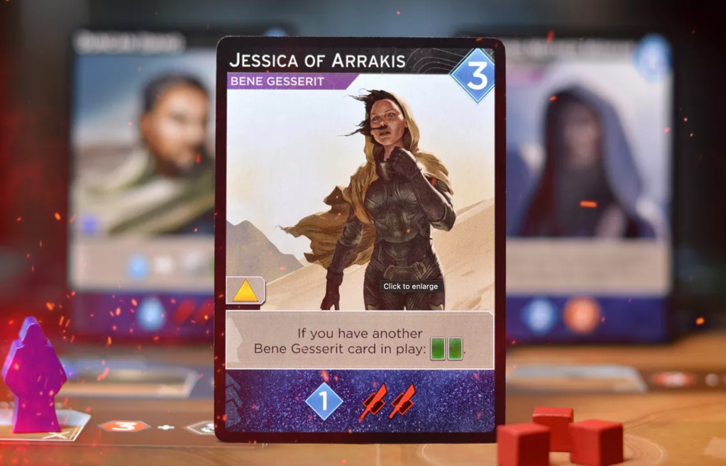
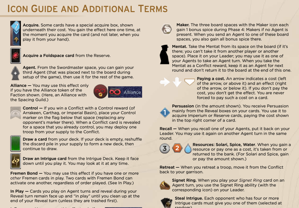
Another game that does this well is Dune: Imperium. The bottom part of the card below grants 1 buying power and 2 conflict power. The icons achieve this faster and with instant recognition. In this case, it’s interesting that the purchasing power image is actually more of a symbol; it’s just a diamond. While the conflict image is an icon as it represents a weapon used in combat. One may require some explanation (even if it’s very brief), while the other is more naturally understood. There are other icons and symbols at work on the card, though. It’s interesting to see that the green cards probably mean you draw cards, while the yellow diamond is definitely a symbol, and without the rules, you have no clue what it means or does.
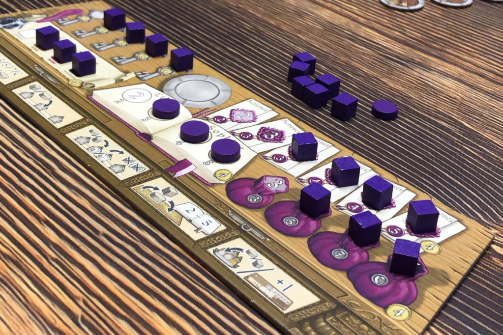
Finally, let’s consider Hansa Teutonica. The game isn’t really built around icons, but they are used in some key places. In particular, note the player action reference on the bottom of the player board. It’s not enough to teach you the game, but once you know how to play, this is a great reminder of how each action works. It’s interesting that they could have written it out, but instead went with symbols that are chained together to form a structure that explains each action.
Badges and modifiers
Some games have icons with badges or modifiers added onto them. For example, a game might have an icon for a card. On its own, it means you draw a card. But add a red X to it, and it now means to discard a card. These modifiers are a whole other subset of icons. These typically show up in larger icon systems.
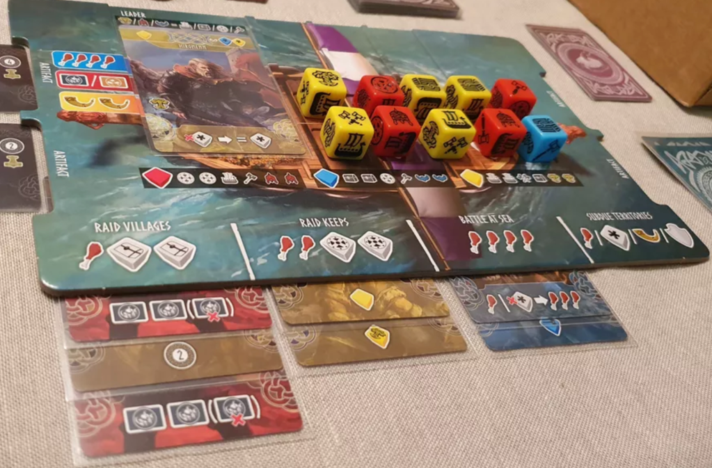
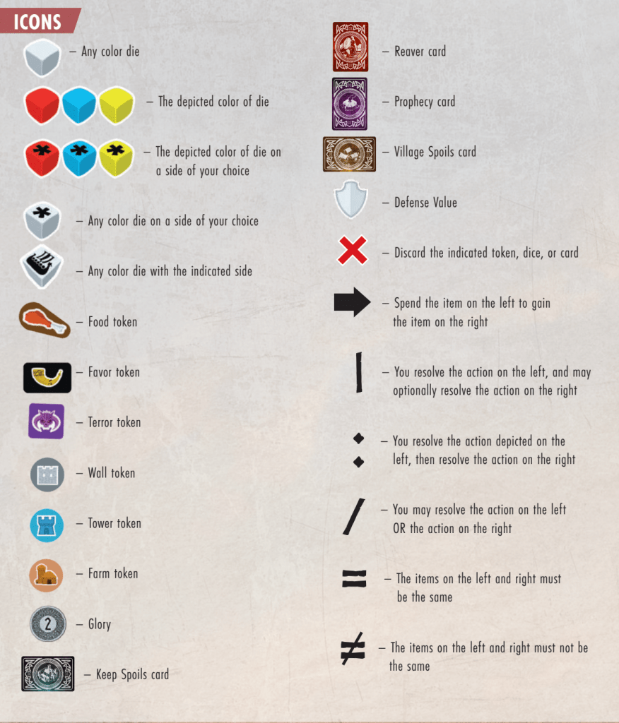
Reavers of Midgard is an example of this. The icons still form a sort of language. But now they have modifiers that can be added to them to change the meaning. Note on the red card in the left of the image that there are 3 card icons. The last of which is in parentheses and has a red x on it. This card can be read that you draw two and discard one. Once you know the language and the way the modifiers work you can easily read it and do what it says.
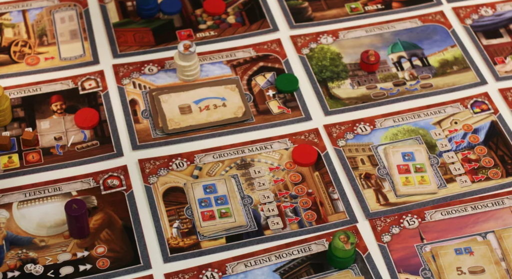
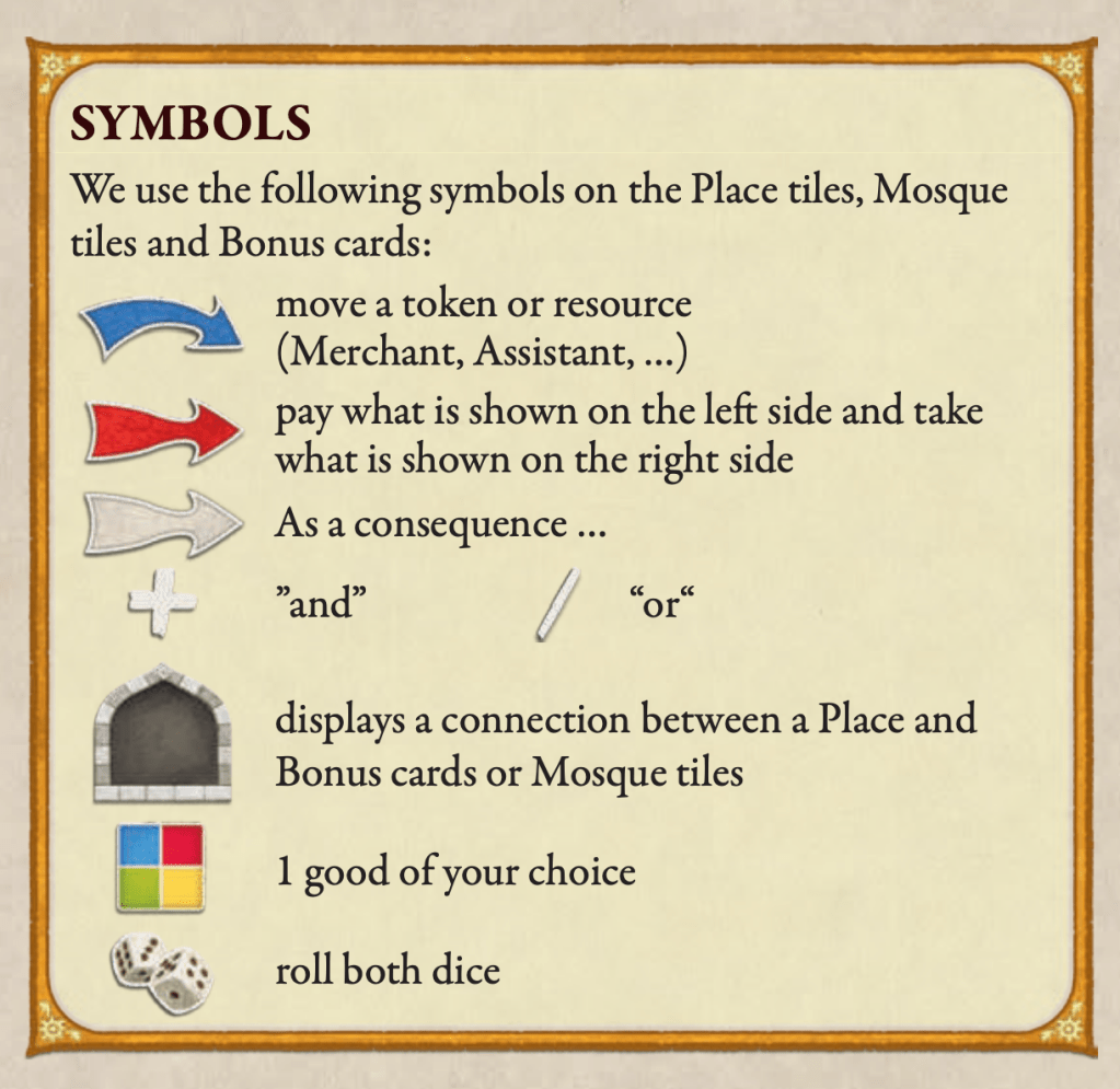
The game Istanbul has a different approach to modifiers. Instead of overlaying them, they have different types of arrows. The blue arrow moves stuff, the red arrow spends stuff, and the white arrow is a consequence. It is an interesting approach. Once you know how to read it, it’s super easy to understand the meaning of the icons alone and together.
Primarily symbols
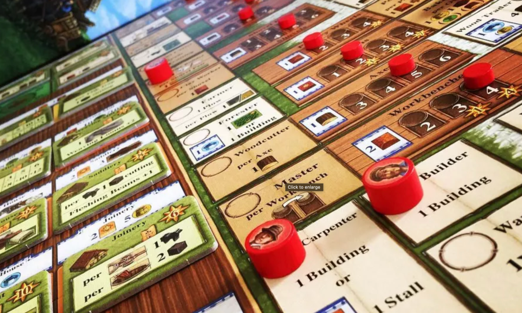
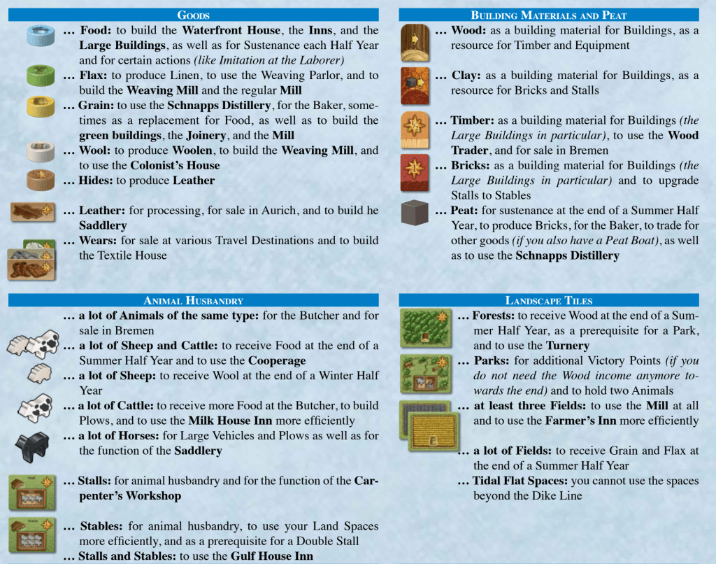
In some games, the icons are really mostly symbols: abstract representations of the item. Fields of Arle is like this. If you look at the system of symbols in this game, they mostly represent concepts or a series of things that have to happen. This is kind of like the Endeavor: Age of Sail example, but to the extreme.
Icon Collecting
Finally, I want to consider a type of game that impacts the types of icons that need to be used. In “icon collecting” games, players seek to collect icons for various reasons. In these games, the icon doesn’t typically actually do anything. It’s more like it’s a benefit or bonus from something you have already done.
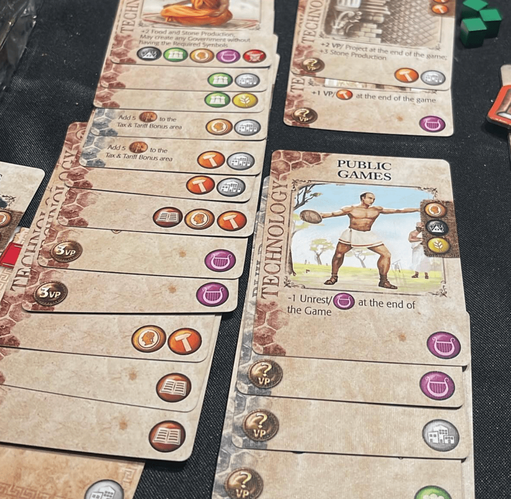
Consider Mosaic: A Story of Civilization. In this game, you seek to collect icons that will empower you to play other cards. However, many of the scoring cards give points for symbols of a certain type. In this way, your collecting the icons, though they never do anything or have an effect to resolve.
In games like this, the icons can be symbols for the most part because it doesn’t really matter what they look like, so long as you can tell them apart. This is why you typically see a combination of a single-color icon over a colored shape. With these two identifiers, you can quickly find how many you have of a given icon.
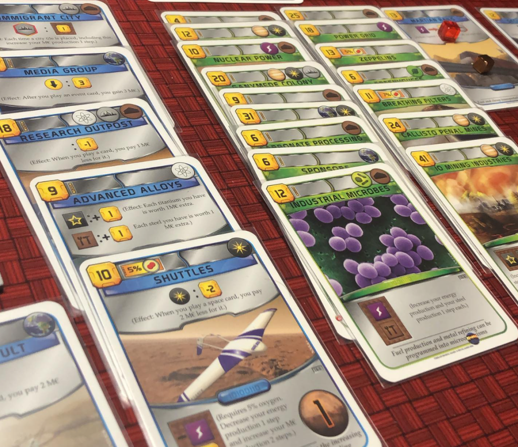
Another well-known example is Terraforming Mars. Much like in Mosaic, you are collecting these icons so that they will trigger off of the scoring cards. Note the intentional placement of these icons so the cards can neatly stack. These thoughtful design elements make the player experience much easier and more natural.
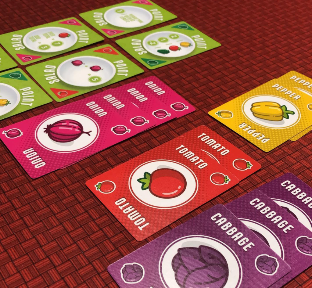
Another super clean example is Point Salad. Here, the colors of the cards and the symbol in the corner all align to make these super easy to tell apart.
Creative Approach
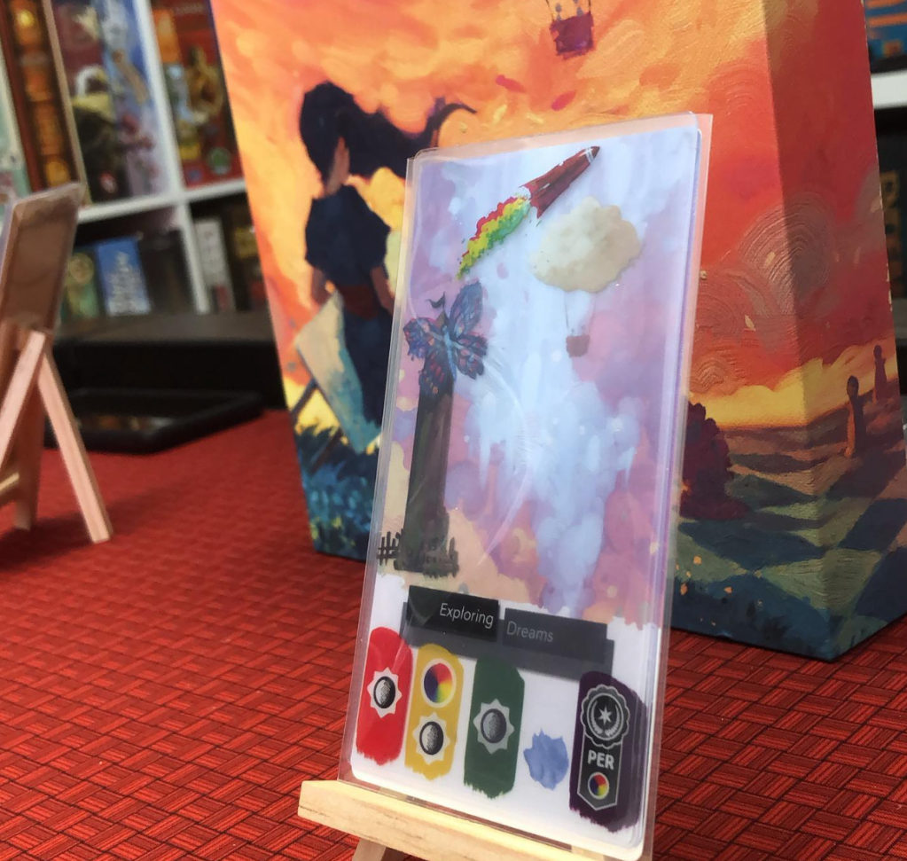
Canvas is an interesting example of icons and symbols. You can certainly tell them apart and suss out their meaning. But the way the game uses them is very unique. The cards are all transparent, and when they are overlaid, the icons are combined to create a single card. In this case, words simply would not have worked. They had to distill it down to icons or symbols such that it could work.
In a supporting role
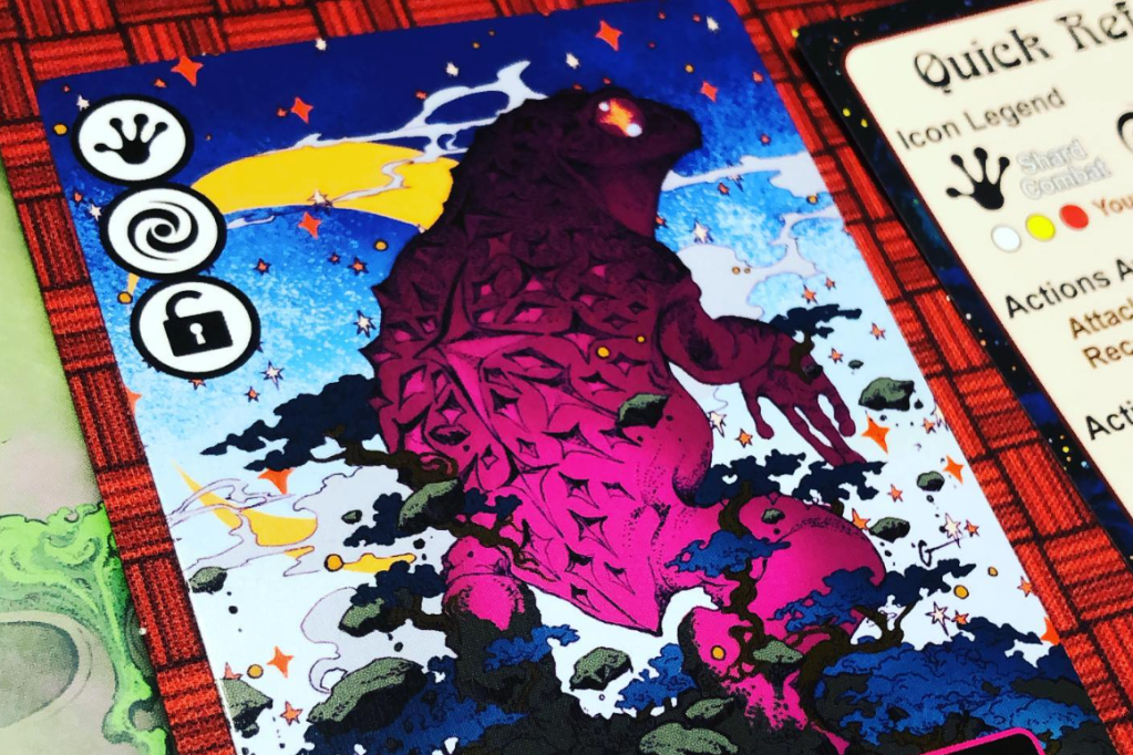
Icons don’t always have to take center stage. In Cosmic Frog, there is sparse usage of icons. But they serve as a rapid reference that is easier than words would have been. Though they are helpful, they just play a supporting role in the game. Don’t be afraid to dip your toe into the icon world. Sometimes you just need a small dash of it to smooth out one part of the game.
Conclusion
As you hopefully see the ability to figure out the meaning of icons is almost always tangled up in how the icons are used. One thing transcends all of these approaches though, and that is consistency. When a design seeks to use icons it needs to do so the same throughout the entire experience.
