In the field of Information Architecture (IA for short), there is a frequently used principle that says content should be repeated in all of the appropriate contexts. This means that rather than finding the one exact spot that content should go, it’s available from all the places people might expect it to be. This sounds like a simple concept, and it really is, but it’s also really easy to ignore. Many times when one advocates for the repeating of information, the idea is shot down because repetition is somehow viewed as a bad thing. But when an application or website does embrace this concept, it just makes it feel like the content is always where you expect it to be.
A real-world example that is very easy to understand can be found at your local grocery store. Notice how there is candy at every single checkout? Why not just have it in one spot? They want you to find it, no matter where you are. Or have you ever noticed that the chocolate syrup is added at the ends of the ice cream section? Even though it has a “normal” place elsewhere. It is the same principle at work (though it has a different motivation). In board games, we can easily see how repeating information in the correct context can greatly streamline the game and improve the player experience.
What is information architecture?
Information architecture (IA) is the practice of organizing information so that it’s easy to find and understand. It’s used to design websites, apps, and other digital products. People working in this space focus on basic aspects of information, including: organizing, labeling, navigating and searching for information.
Keywords and their meaning
Many card games, and especially trading card games, make use of keywords. Keywords are just special words that have a whole set of rules associated with them. Typically these are presented in bold text to remind you that this one word is special and carries meaning. It is a great way to make text shorter. One pattern that I have observed is that the first set of cards with a new keyword will often have the definition of the new word on the card. Below is an example of a card from the World of Warcraft TCG. Note that the word “invincible” is a keyword. The follow-up text in italics is an explanation of that keyword. Also, notice that it has a description of the keyword “mount.” This is so simple, but so helpful to make the playing experience better. Once you know what it means you can easily ignore the explanations. But it helps onboard new players and new special words with great ease. What elements in your card game could be repeated on the cards?

Another example of this is Ark Nova. Here the keyword is “glide 3.” Rather than assume you know what it means, it has the definition right there. Some players will see the short version and instantly know what the card does. Overall, this just makes for a smoother player experience.

Player boards
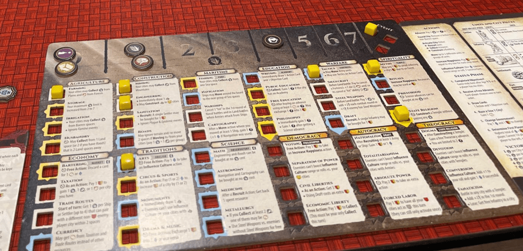
Perhaps one of the most effective places to repeat information is on player boards. I had to stop looking for samples because there were just so many great ones. The player board sits in front of the player and will be used throughout the game. What better place could there be to have important details repeated, especially since this is often the context the player will be in when it’s used?
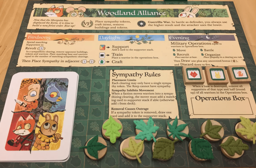
Root is a shining example of this. Each faction in Root works radically differently from the others. So much so that repeating the core rules for each faction on their player board is a necessary aspect of the design. This is an extreme example, for sure.
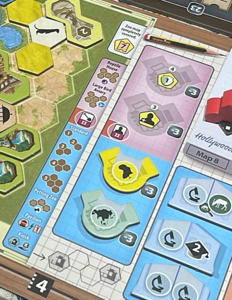
Ark Nova is such a great example of this principle. It has key bits of information repeated in the context of use. Shown below is a portion of the player board where it reminds you what you can build and the special case with kiosks that have to be a certain amount of space apart from each other. I think it’s interesting to note that had they not baked all this repeated content in, they might have needed a player aid as a separate object for players. How much nicer is it that they put it right on the boards and cards instead.
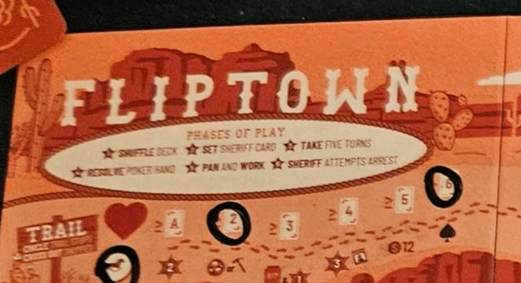
A common thing we find on player boards is a reminder of the steps in a turn or round. This is what we see on the player boards in Fliptown. This is super helpful and keeps players on track. But the player board goes further than that. Nestled around the board, in all the relevant spaces, little details of the rules are repeated. Once you notice this, you literally never need to reference the rules. All the little bits you might easily forget are in context to remind you. It’s a wonderfully well-designed player board that makes for a satisfying player experience.
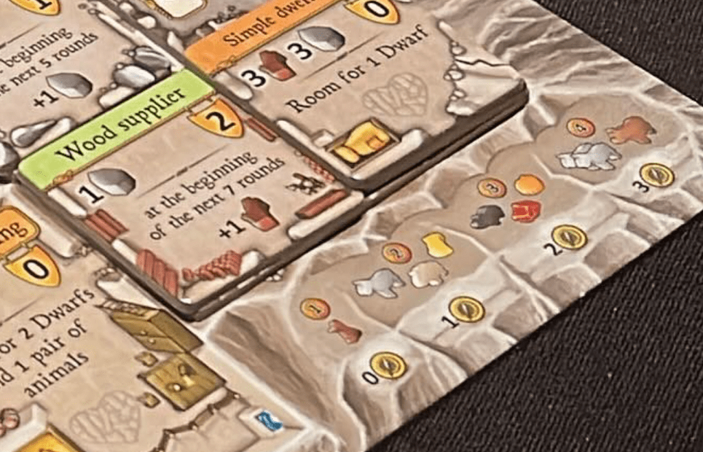
Sometimes a player board can focus on a key aspect that is easily forgotten. Such is the case with Caverna. In the bottom right of every player board is a reminder of how to feed your people using the resources you have.
Sometimes turns are so simple you don’t need to explain the structure, but instead, you just need to show the choices you have. Such is the case with Long Shot. This player board has a little reminder of all the actions you can take and what they do. When you learn the game, it feels like too much to keep track of. This little reminder smooths the way and is great to point out to new players.
In the case of Sushi Roll!, the designers choose to remind players of the way things score. It also reminds you how many tokens you start with and how much those are worth at the end of the game if you don’t use them. This is nice as it’s such an easy thing to forget. And with the dice all scoring in different ways, reminding players of what each does is crucial to easy gameplay.

In this final example its interesting to see an extreme usage of the idea. The player boards in Clash of Cultures are essentially one giant repetition of information. Without this well designed player board the game would not be playable. It reminds you of all the interconnections, exceptions and limits of the various upgrades.
Shared spaces
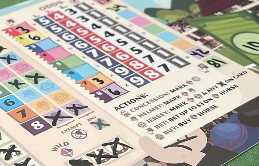
Most games have some sort of shared space. Typically this will be a little farther away from players. As such the information either has to be larger, simpler, or both. If we look at the game Fromage we will see how this concept is put to work. In Fromage the game board rotates so that the portion of the board your concerned with is in front of you. Each of the 4 wedges of the board is a different mini game with different scoring patterns. In order to remind players how each region works there is a repeat of the scoring details somewhere on the wedge. This ensures players don’t have to recall this information.
In Lords of Waterdeep, the round tracker has gems placed on it in order to remind you to add them to the unpurchased buildings. It also has an arrow in the 5th round when all the players gain an additional worker. This is so elegant; it just feels like it’s the way it was supposed to be. It shows that repetition sometimes takes on different forms. The physical pieces and a simple arrow are all that is needed.

Player aids
I have a love-hate relationship with player aids. I love them for the obvious reasons. They make learning and remembering how a game works significantly easier. And they are absolutely essential to many games, and frankly, more games should have them. Or should they? In my opinion, many games that could have them don’t need them because they are well designed. I don’t mean mechanically; I mean the graphic design of the game is structured such that the learning and remembering are built right into the design. Many games could avoid having an aid simply by weaving that information into the player boards, cards, and so on. Naturally, there are times when it really is the only option. And that’s fine, but whenever possible, it’s my belief that we should try to avoid needing them.
Scroll back up through the games listed so far in this write-up. The only one that has and needs a player aid is Clash of Cultures. And that’s because the player boards are already jam-packed with reminders! Many of the games listed could have cleaner visuals by taking away all those helpful in-context reminders. Sure, they would appear more beautiful because of this, but the player experience would suffer.
Missed opportunities
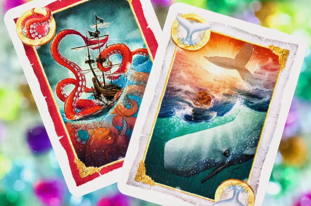
The trick-taking game Skull King is actually a really awesome game. It is super clever and is unlike any trick-taking game I know of. However, one place it falls short from a player experience standpoint is that the special cards, which are not just numbers, have zero text to tell you what they do. Shown here are the Kraken and the Whale card. But what do they do? Well, you will have to go read the rules or consult a player aid. And nothing says “hey, I have a special card” like asking for the rulebook.
How to do this right
It will probably come as no surprise that the way to do this right is to playtest. Observe what people ask about, what people forget, or what people do wrong. Those are things that need guideposts. Perhaps a player aid is needed. But first consider how you might weave the needed information into the context the players are experiencing. Is it a score-based trigger? Add a note or pointer on the score track. Is it a special word on a card that players get wrong? See if you can add the rules to the card. Do players frequently misuse a component? Provide a reminder in the place where the component is not allowed. The point is to pay attention to both the problem and the context of the problem. Working from there, you can try to provide the most elegant version of the repetition.
