
The degree to which your game is accessible can have a very significant impact on the player experience. One factor that can contribute to this is the game pieces themselves. In order to be accessible, they should be easy to handle and tell apart. The easier it is for people with physical limitations to play the game, the better the experience will be for those players. For example, in this specific context, a player with limited fine motor skills should be able to play the game.
A hallmark of this principle is worth showing to help paint the picture for why this is so important. In 1990, the OXO brand released its line of easy-grip kitchen utensils. Among those was the vegetable peeler shown below. These tools were heavily researched and designed to be accessible to all people in the kitchen. This means that seniors with arthritis can easily use this tool for example. If you look at the peelers that came before this one (shown below), you will quickly understand how significant this transformation was. There are many aspects of this that are interesting (to some of us anyway), but the most important realization with this tool was that not only was it good for those with disabilities, but it was really good for everyone else as well. It turns out that designing products that are inclusive resulted in something that was better for everyone. This same principle applies to the world of board games and player experience. Aspects that make a game more accessible will potentially help all players have a better experience.


What is Accessibility?
In technology accessible means that a person with a disability has the opportunity to acquire the same information, engage in the same interactions, and enjoy the same services as a person without a disability. In game design Accessibility means that as much as possible players with all levels of ability should be able to play the game. What’s interesting though is that often times whats good for a person with a disability is good for everyone else as well.
With this understanding of accessibility and how the physical components is important, let’s dive into some examples.
Big and chunky
With the OXO vegetable peeler in mind, the clear place to start is with components that are big and chunky. And given that the current trend towards big, overproduced games, there are plenty of samples. It’s super interesting how this trend is creating games that have improved accessibility when the focus is really on just being big and beautiful.
Foundations of Rome is a city-building game where each player is building their own city. Each building is a polyomino (Tetris shape). But instead of being flat cardboard, each is a fully 3-dimensional plastic piece. Obviously, this was done for aesthetics, and it is definitely super beautiful to look at and play with. Most games of this type that use polyominoes are at least to a small extent fiddly, where the pieces are easily bumped and sometimes hard to handle. I could see this being a real physical limitation for some players. But these big chunky buildings are just super easy to handle.
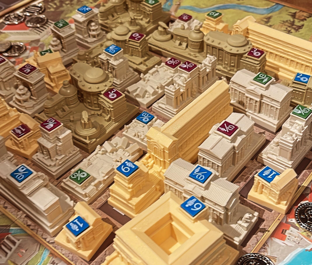
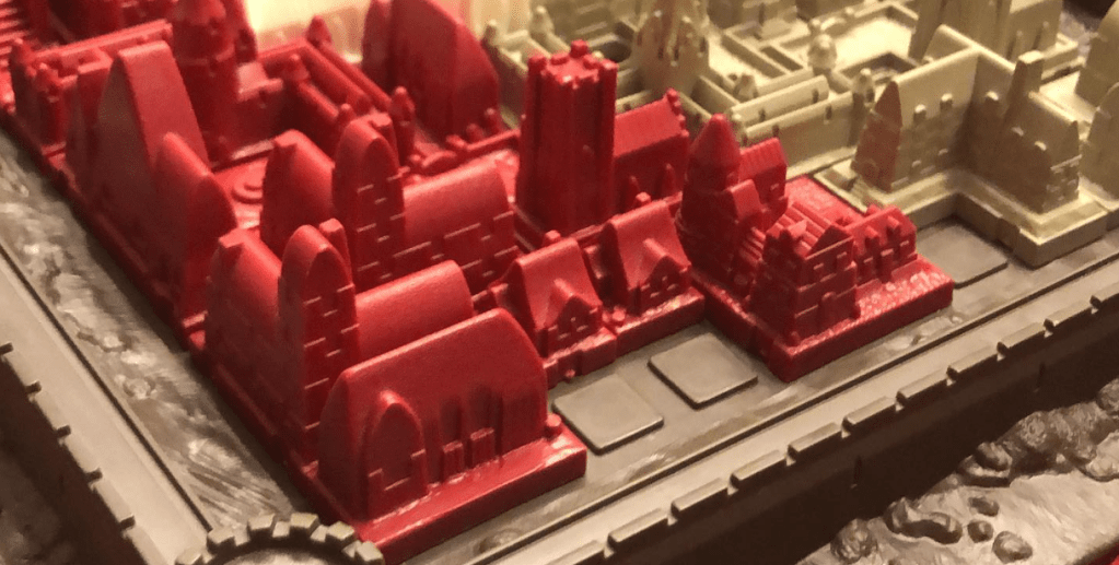
About the only way Foundations of Rome could be improved from the perspective of making pieces easy to handle is if the player boards were keyed so that pieces locked into place. In the image below, we see the 1986 version of Cathedral with similar large buildings. But note how the board is keyed so that pieces lock into place. This extra little bit enhances the handling of the pieces.
One final sample to consider is Tapestry. This is yet another game with big, fancy buildings. While the physical size does make them easy to pick up and handle, I want to instead focus on the way in which you can differentiate the buildings. The second aspect of the principle being discussed here is that you can easily tell the parts apart from each other. Note how the unique buildings are multicolored and all look different. In contrast, the small, single-space basic buildings all look the same. This makes it easier to track how many you have of each of those, which is relevant to the way the game is played. So, while it might have been tempting to make all those small buildings unique, it would have made the game harder to play. It is neat to see how small details like this can make a game more accessible. And sometimes it means doing less and being thoughtful about the physical components and how they will be used.
Using multiple indicators
One key to making your components accessible is to use multiple ways to indicate the difference between them. This will make it significantly easier for players to tell parts from each other.
A great example to start with is Inventions: Evolution of Ideas. The wooden tokens in this game come in an assortment of shapes. Each of which serves a different purpose. It’s very important for players to be able to tell them apart. In addition to using different shapes they have also used different colors and have information printed right on them. So in some cases the shape has 3 things to help players identify them (shape, color and art). In a game as complicated as this one, this is a welcome aspect of the design as it avoids further confusion over the purpose of different shapes.
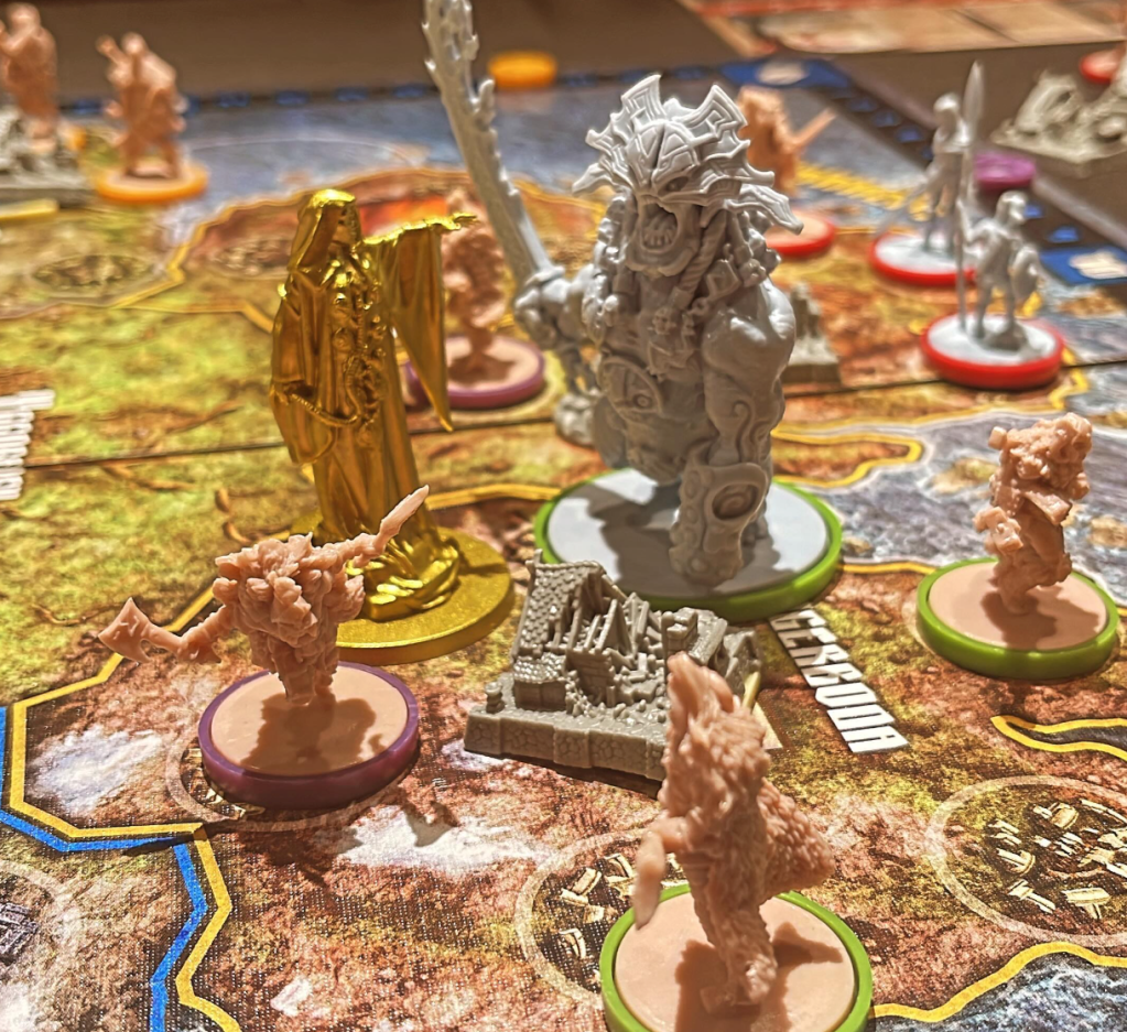
One common aspect of many CMON games is that they always have lots and lots of miniatures. These minis are never pre-painted. So as a publisher, they could just print them all in one color to save money and let players sort it out. Fortunately, they do not do this. Instead, they use color and bases for the minis to help players identify the pieces on the board. Let’s consider the game Blood Rage. In the image below, you can see the god figure (in gold), the special monster (in grey with a green base), and all the player figures with tan plastic and colored rings on their bases. This all helps players to instantly recognize the pieces and easily know who each figure belongs to. This is absolutely critical to the ease with which you can play this game. It’s a great example of how accessibility makes things better for everyone.
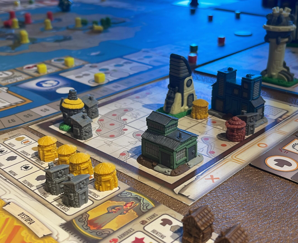
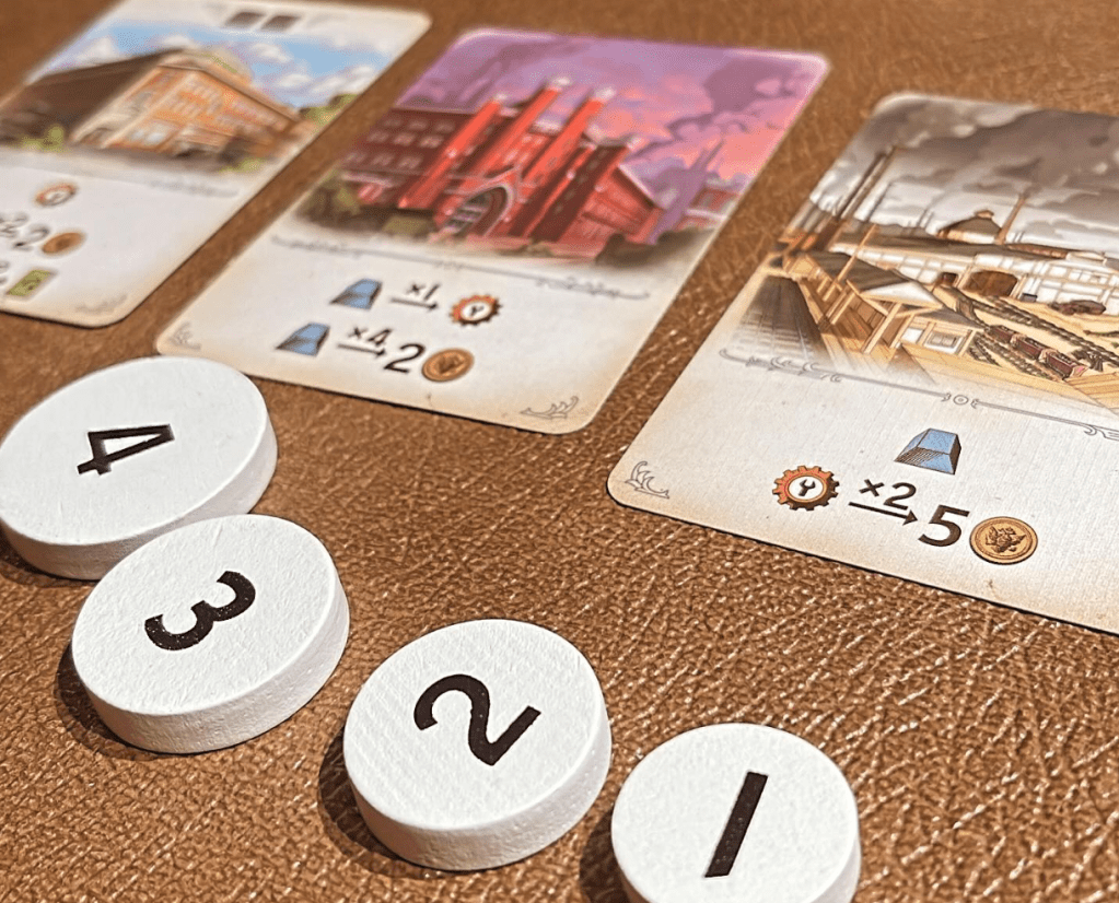
But you don’t have to use big chunks of plastic to have multiple signals to players about a pieces function. Furnace is rather small in comparison, and doesn’t have large extravagant pieces. In this game you have 4 tokens to bid with. You can see in the image below that the tokens are numbered and scaled according to their number. 4 is your most powerful piece and this is reinforced by the fact that it has a larger token. The game uses both content (the numbers) and size to communicate to users which is the most powerful. Could your game use something as simple as this to improve its accessibility?
Physical supports
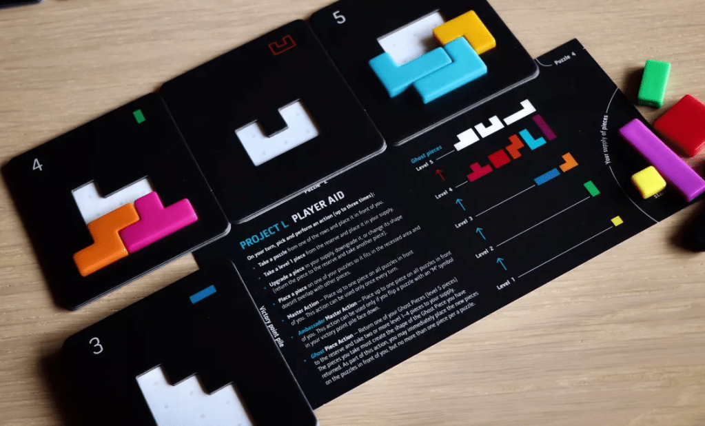
One way to make parts easier to handle is to offer some kind of physical support. Some mechanism that makes the game more accessible and easier for everyone to play. A simple demonstration of this is Project L. In this game, you’re collecting shapes that you will need to fit into tiles. When you complete a tile, you get your parts back, and you score the tile. These tiles are double layered such that the pieces fit in and can’t slide all over. The pentominoes aren’t particularly big, so it is very welcome that the tiles are double layered.
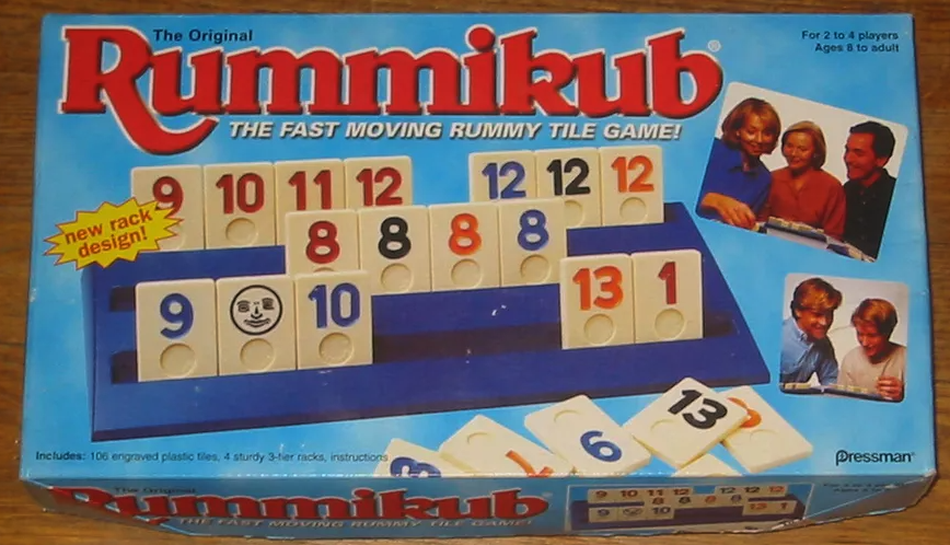
Another, but much older, example is Rummikub. Almost every version I have seen of this game comes with a rack to put in front of you. This makes it vastly easier to see what you have and to interact with your tiles. It’s such a great accessibility feature. Think of all the people over the years that have limited motor skills but have been able to play this game.
Terrible tokens
Sadly, one of the best ways to illustrate a point is to show some poor examples. Ironically, all of these come from games that I have loved. One of the worst kinds of tokens gamers have had to encounter is the tiny chits that came with RPG games in the 80s. These tiny little squares were such a pain. The ones below are from Star Frontiers. I would like to think we left terrible tokens like this in the past, but sadly, that is not the case.
A modern example of a game with this exact problem is Comic Hunters. This remarkably good game has painfully bad tokens. They look okay, but they are impossible to pick up or manipulate without causing a mess. This is such an obvious problem that it is 100% a result of budget constraints. The tokens just make the game feel cheap, which is really unfortunate.
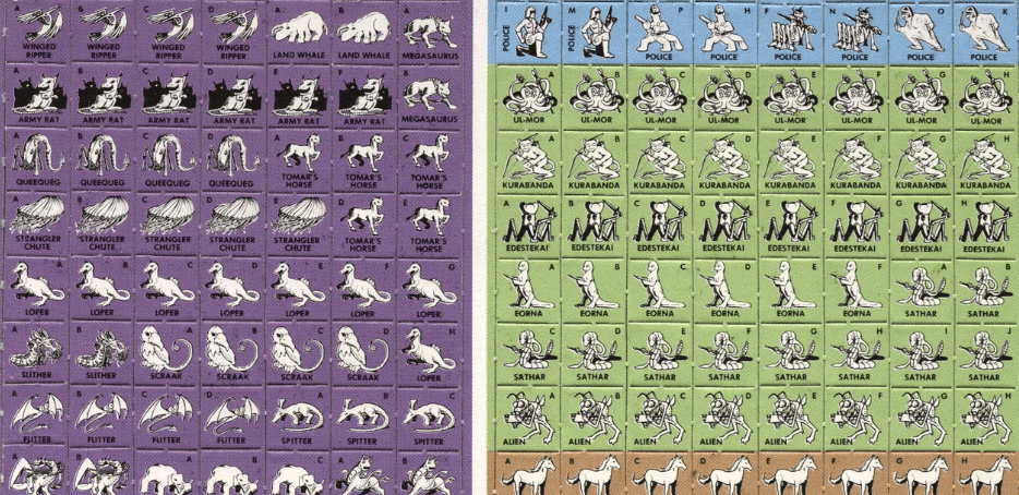
Another beloved game with super obvious accessibility problems in this area is War of the Ring. The game has 8 political tokens. These are two-sided, and it’s important to note which side is up. First off, the icons on these cards are extremely hard to differentiate. Yes, I can study them and kind of see what they are talking about. But in play, you look across the table and you have no clue which one is for which faction. Also note that the only difference between the two sides is the border color. This means colorblind people are likely going to struggle as well.
I know I am picking on the game, but the problems in terms of accessibility and telling pieces apart go to the very heart of the game. See all those horses? You need to keep track of which is which during the game, a task that is next to impossible without modifying the game in some way.
How to account for this
So how do you account for this aspect of accessibility in your game? It starts with you, can you handle the parts? Can you tell the things apart from across the table? If not, why would you expect players to. Once you think you have solved for it, see how play testing goes. Watch for players struggling to pick things up, or those that get confused about telling pieces apart. These are all sign posts that you have something to adjust. It’s not the players fault for getting these things wrong (though they will likely blame themselves). All it takes is a little effort and intention.
