Typography is the practice of arranging letters and text in such a way that the text is legible, clear, and visually appealing to the reader. This skill set is typically a part of graphic design. Strong typography can elevate a design in ways that most people don’t see or understand. It is also one of the most challenging aspects of graphic design. To see how typography can contribute to the player experience we will consider the basic principles of typography and some examples of each at work.
Principles of typography
Entire books have been written on the topic, so it’s a real challenge to summarize here. But like many fields when you know very little, even a survey of the basics can have a radical impact on your skills.
The principles of typography we will consider here are:
- Readability
- Scannability
- Typographic mood
- Typographic scale
- Alignment
- Emphasis
- Proximity
Readability
At its core text must be readable. That is to say, it should be easy and satisfying to consume. All of the other principles listed here have an impact on readability. But some extra elements in particular can impact readability:
- Avoid all capital text: it’s safe to use all caps in titles and headings for the most part, but the main body of text should not be all capitals. It slows down reading and makes it much more taxing on the human brain.
- Background contrast: ensure that your text has sufficient contrast against the background it is over.
- Careful use of decorative fonts: Decorative fonts are great for logos and sometimes headlines, but make for a terrible choice with large bodies of text. This is an example of a decorative font. This is great for a logo, but not body text.
- Size matters: the smaller the text is the harder it is to read.
- Proper line length: for body text, you should try to limit a row of text to 50-60 characters (letters). This is why you frequently see multiple-column layouts in rule books.
A wonderful example of readability, and overall excellent graphic design, is Smartphone Inc. This beautifully designed game is a master class in strong typography. The text follows all of the guidelines listed above and is super easy to read. Note how willing they are to use white space to keep things easy to read.
Scannability
The text should be scannable. This means that a player should be able to scan through a rule book and spot the topic they are looking for. Players should be able to scan their player board, or cards, and find the elements they need to focus on. As with the other typographic principles, good scannability is strongly related to the other principles. But there are a few key things to keep in mind:
- Consistency: the structure you use for headings, subheads, body text, and layout should be consistent across the design. This makes it easier to scan. Set your rules and follow them. This is not just good for typography, but good in general. A lack of consistency (especially in type treatment) will cheapen a design.
- Hierarchy: If all of your text is the same size and weight it will be very hard to scan. The stronger and more clear your headings and subheadings, the easier it will be to scan.
- Use of emphasis: It can be extremely effective to bold keywords. This helps the jump out of the page and catch the reader’s eye, thus making the text more scannable.
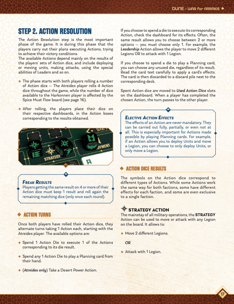
Below is a sample page from the rulebook for Dune: War for Arrakis. Notice how easy it is to scan the page due to the clear visual hierarchy and consistent structure. Additionally, they provide extra emphasis to specific nuances with the blue border boxes. These details will prove to be very important as you play the game.
Typographic mood
It might be weird to think about but type has a mood. The single most influential aspect of typography mood is the font you choose. This is much easier to see when you look at some extreme examples.
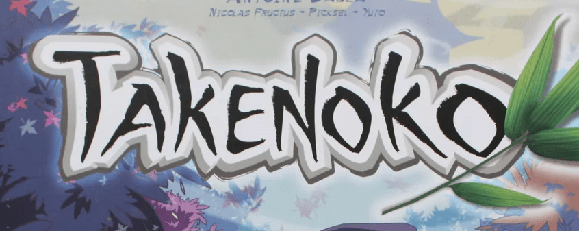
What would a happy font look like? The text used for Takenoko feels cheerful, playful, and certainly happy. It also has an Asian feel to it. All of this contributes to the success of type treatment.
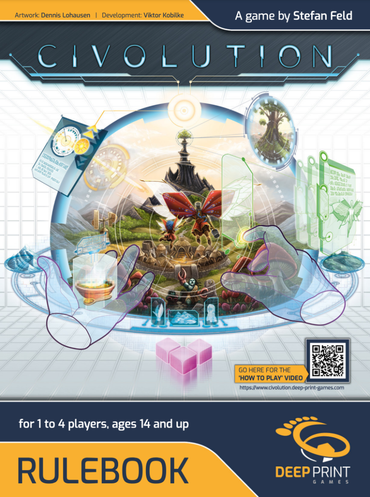
Futuristic or sci-fi fonts stand out and give off a specific vibe. Civolution is a game set in the future and its font choice is totally spot on. The title text is futuristic. But also note how the supporting text has a subtle futuristic vibe to it. It’s sans serif text, which is typically modern, but it has enough of that stereotypical sci-fi style to it that the theme is strongly reinforced through beautiful typography.
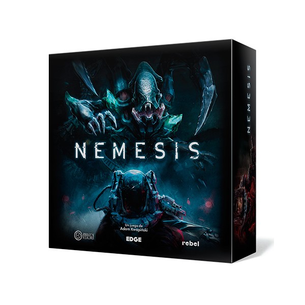
Notice how the futuristic vibe of the game Nemesis contrasts that of Civolution. The overall dark aesthetic plays into this, but the font choice is subtly different. The text in the logo for Nemesis is a little more serious and befitting of the game. And the type on the cards is beautifully done using a typical sans serif font. All of these combine to a solid contribution to the dark futuristic theme of the game. It might seem like the art is doing all the work here, and to be fair it does a lot of the heavy lifting, but if the text did not reflect the same feel it would feel broken and cheap.
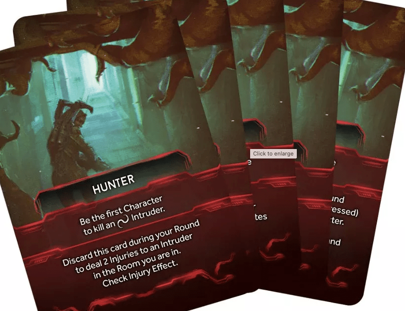
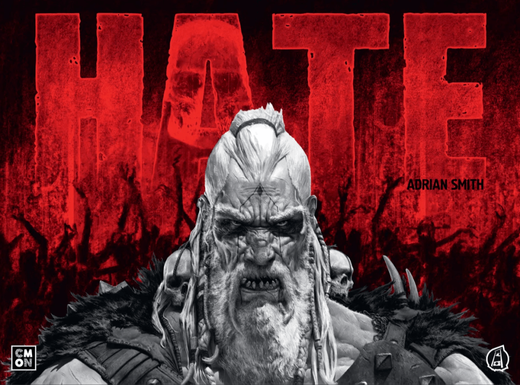
What would angry text look like? The game Hate is a perfect example of how text can put off a clear mood. Here the text is almost an illustration but it reflects the theme of the game.
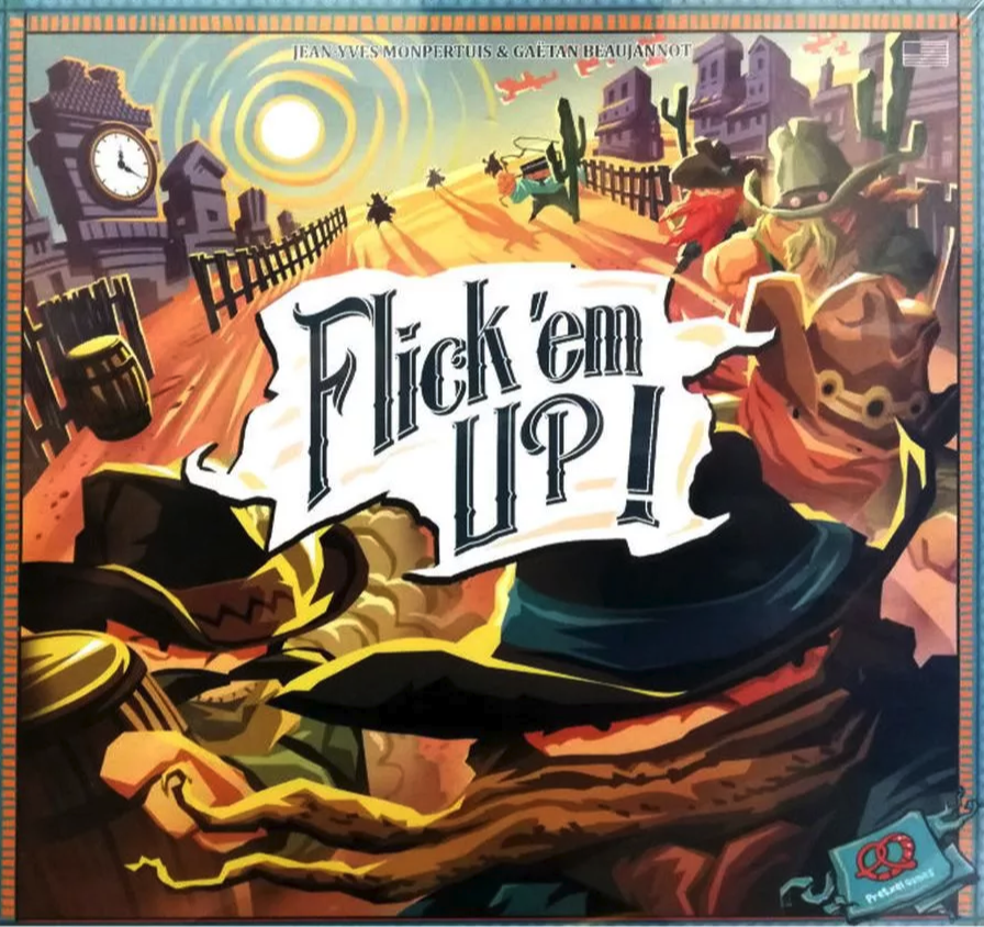
What would a fun playful Western font feel like? Flick ’em Up shows us a great example. It uses what we can easily see as a stereotypical Western font. The title is presented in a fun and playful way. Note how they created a container to ensure the text had proper and consistent contrast against the background.
All of those samples are great and get the point across, but they are mostly decorative fonts. This means they are good for logos and headlines, but not so good for bodies of text. But even plain old boring text like Times Roman or Helvetica has a mood.
Standard sans serif text (meaning without serifs, the little decorations, and the end of text), has a modern feel to it. So don’t use it for a game set in the 1900s. Here we can see that all the text in XenoShyft uses sans serif text. The cards are lovely but I would greatly prefer it if they did not use all caps for the text, it makes it much more tedious to read.
In contrast, serif text (fonts with decorations on the end of letter forms) has a more traditional feel to it. The game Obsession is set in the mid-19th century and makes great use of period-appropriate type. The serif body text fits the theme and the fancy script headlines put off the right vibe. Note that if they had done all the text in that fancy script it would have been absolutely painful to play. But the titles aren’t really important, it’s more for flavor, so the decorative script is just fine.
Limit your typefaces
One of the absolute best ways to create strong typography is to limit your typefaces to as few as possible. A single font for your logo plus a large font family for the rest of the text is a solid and safe approach.
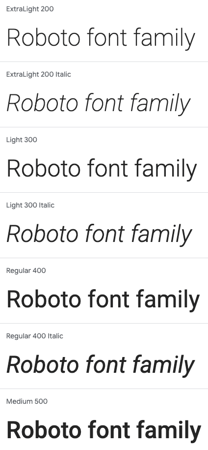
Many fonts only have a single version, but many have large families of variants. Font families are sets where many different weights of a single font are included. Google’s Roboto is a great example. Its base font has 9 different weights plus those same 9 in italics. And then there is Roboto Condensed, with another 9 different weights. One could easily use Roboto for all of the text in a rule book for example. Roboto Condensed would be great for the headlines (condensed fonts are meant for large text and are more narrow to allow for this), while a normal weight of Roboto could be used for the body of text.
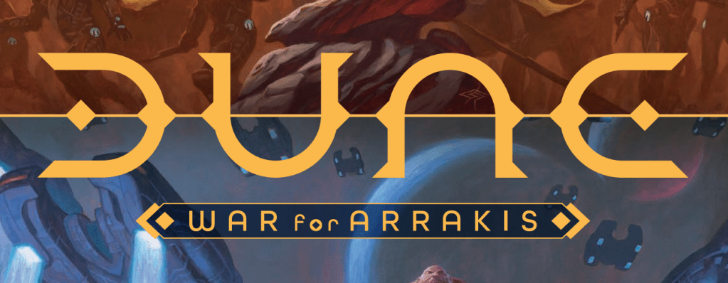
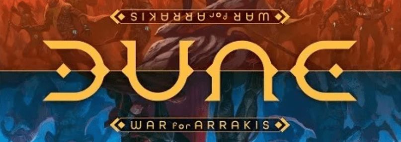
One final thought and important rule to follow is that the font used in your logo should not be used in any other aspect of your game. When you use the same font elsewhere it erodes the feel of your logo. You want the logo to stand out as its own thing. Take for example the Dune logo below. This highly decorative font is not used anywhere else in the design. Not even in the subtext for the logo. The subtext instead uses a similar style font, but it’s smaller so it’s a more “normal” font.
Typographic scale
A typographic scale is the idea that a visual rhythm or harmony should be used when choosing the different sizes of your text. There should be a clear scale for the different levels of headings (like heading 1, heading 2, etc) and for your body text.
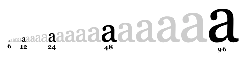
Shown here is one sample where key font sizes are chosen to create an easy-to-understand hierarchy of text. Doing this well will elevate the feel of the type in your game. This element also plays a big role in making your text scannable.
If this topic interests you there is a lot more to it.
Alignment
This rule is super simple. Your typography will be stronger the more you align the elements in your layout. A perfect example is the rulebook text. If the headings are centered, but the body text is left justified, the text lacks alignment and will feel cheaper because of this. Left align the titles with the body copy and suddenly it just feels cleaner.
Seek to align the elements in your design in natural ways and you will improve your typography. As a general rule though you should avoid “justified” text where the text editor attempts to have a straight line down both sides of the text. This almost always results in odd spacing of words and is generally a typographic mistake.
Emphasis
Emphasis is exactly what you think it means. It means to provide focus or extra attention on key elements. Consistency in this aspect will be super important. For example, if your game relies on keywords (that is a word that carries a whole set of rules with it), then those should be emphasized. In this way, players will know that it’s a special word. This example below from Disney’s Lorcana easily allows you to scan and spot the keywords in the document.
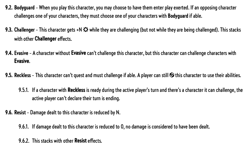
The card below, from the World of Warcraft TCG, demonstrates this principle at work on the cards. Note how the keyword “invincible” is bolded. One nice touch is that they went ahead and put the rules for the keyword right there on the card. A beautiful example of the concept. If memory recalls they would do this when a new keyword came out, and over time they would start using just the keyword.
Proximity
One of the simplest ways to elevate a design and your typography is to use the principle of proximity. This simply means that you should carefully consider how elements are visually connected based on their proximity to each other. Strongly related elements should be visually grouped. Things that are unrelated, or independent of each other should have enough space such that they feel separated.
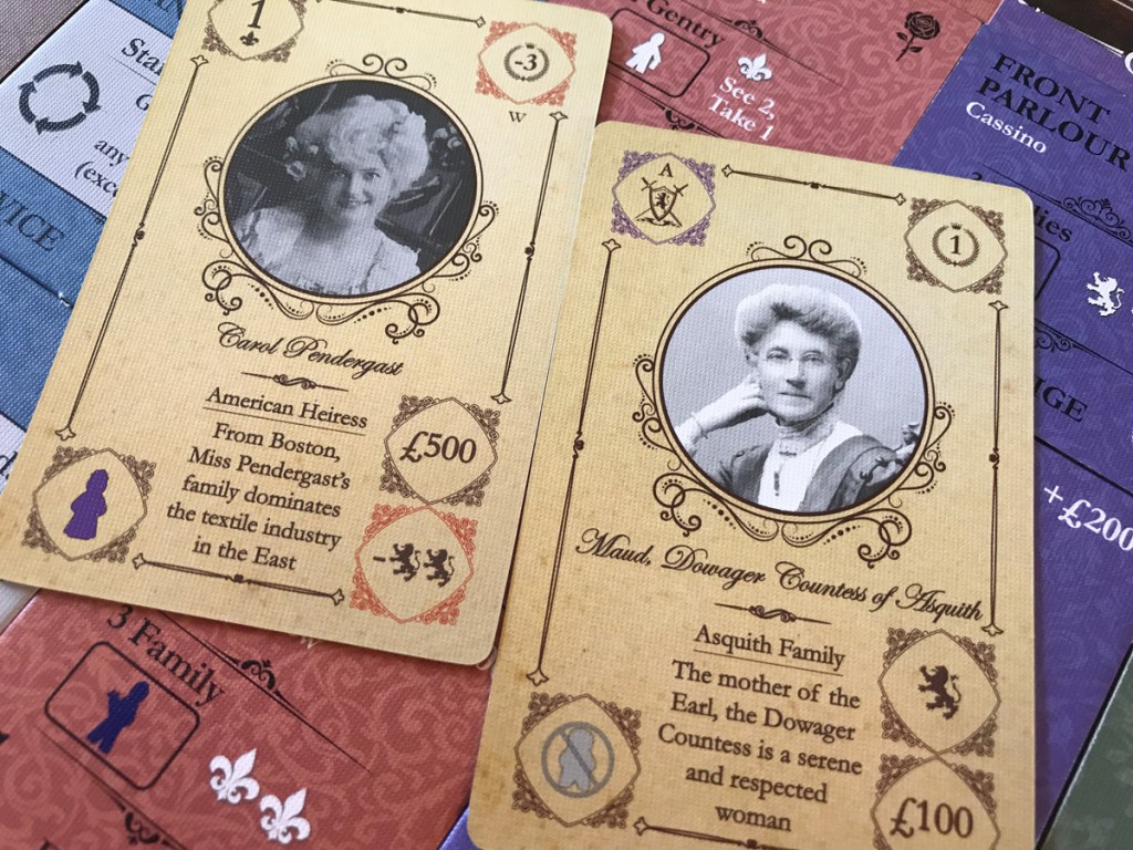
Below is a card from the game Star Realms. Note how the abilities are all grouped in the bottom portion of the card. While the cost and faction are all separated from each other in separate corners. This consistency and use of proximity/lack of proximity make the cards super easy to understand.
Typography and player experience
Sometimes typography is about being functional. Other times it’s about evoking a specific feel. And sometimes it’s just about being beautiful. But great typography does all three of those at the same time. The more you learn about type the more you start to see it as a sort of art form all its own.
Designs that use type well can greatly enhance the player experience. And of course, poor typography can make a game more painful to play. Interestingly players will not typically be able to identify the type treatment as a pain point. Typography is the kind of thing where small problems or mistakes pile up into a real problem, but individually each faux pas seems rather inconsequential. Don’t underestimate or dismiss typography and the role it plays in your game’s design and success.
More examples to learn from
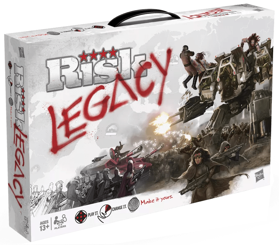
Risk Legacy introduced the concept of legacy games to the world. And the execution of the type, especially in the title, is just a thing of beauty. It works at so many levels. The spray paint style of the word “legacy” is just perfectly chosen and composed. It’s at an angle overlapping the classic Risk logo. The style reflects the fact that you modify the game; tearing some parts up, adding stickers, and so on. It almost has a rebellious feel to it, which is not only thematic but also reflects how it felt the first time you tore up a card. One fun detail is the hidden delta symbol on the “a” in legacy. Delta in math is the symbol for change, and that strongly reflects the way this game works.
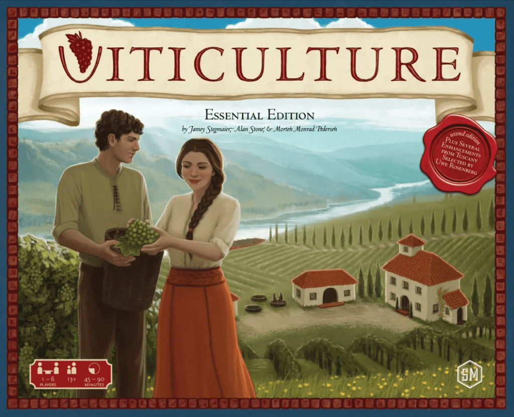
Speaking of easter eggs, one of my favorites can be found in the title for Viticulture. The “V” in the title is being used as a wine glass, which fits the game perfectly. But even better, if you turn it upside down it’s the silhouette of the St. Louis Arch, which is where Stonemaier Games is located. This isn’t just about being clever, these small details elevate a design. There is this concept called proposition density, which is a fun little topic all its own. What it means is that you compare the number of elements you have to the number of meanings it can evoke. And the greater this ratio is the stronger the design typically is. Check out the logo for the the Obama presidential campaign for a deep dive into this concept.
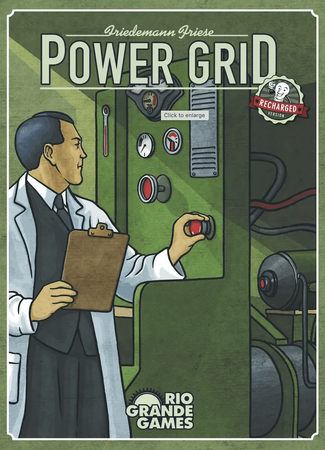
Another example of hidden meanings is Power Grid. At first, the uppercase D at the end feels a bit wonky. But the line between the P and the D echoes that of a power line. Combine this with the sans-serif block type and you get a real industrial feel. It perfectly echos the theme of the game.
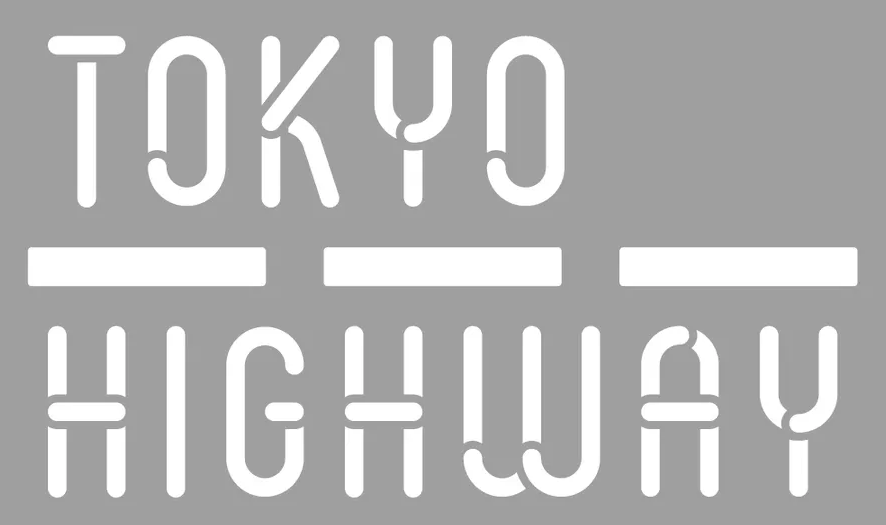
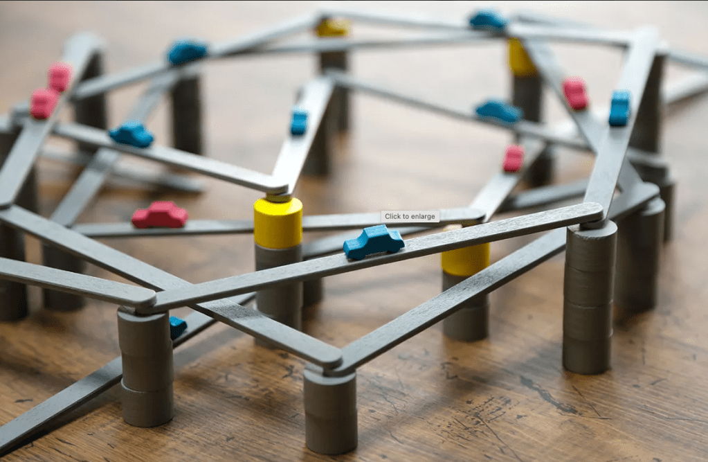
With the game Tokyo Highway, the logo reflects the actual game pieces, which is remarkable. The gray colors play into the notion of concrete. The type and design are in brilliant harmony with the components of the game.
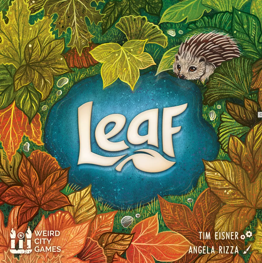
Sometimes text can be transformed into what is almost an illustration. On the cover of Leaf, the text is custom shaped and combined with a leaf to create a stunning visual “whole.” The unity of the logo is exceptional. Note how they put it over the simpler blue area of the background to avoid it being difficult to read on the busy leaves. Such an excellent design to consider.
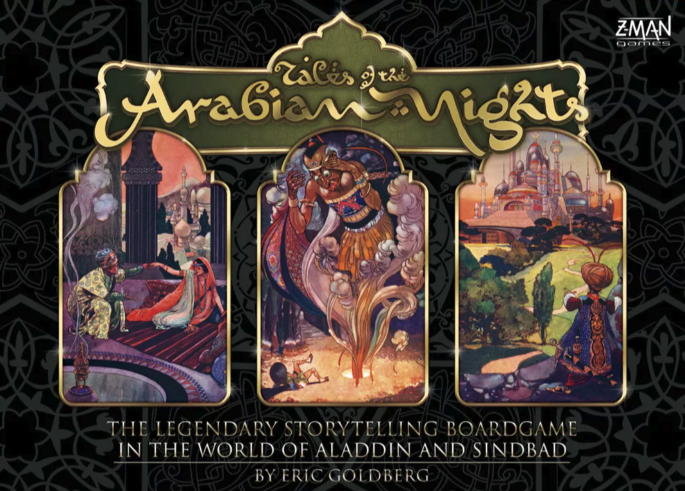
The game Tales of the Arabian Nights has such a strong theme and gorgeous visuals, that it would have been tempting to go overboard with the decorative text. Instead, as you can see below, they reserved the fancy script for the title/cover only. The actual card text uses a very classic feeling serif font. The font might still be more modern than the period this game is set in, but it’s the perfect choice. Players can easily read it and play the game.
Root is such a gorgeous game for so many reasons. And one place it stands out is in its typography. In the image below we see a portion of the player board. Note that the section title is in a more stylistic decorative font, while the main body text is a standard serif text. The vibe of the game is echoed in the text and yet the text is very readable and helpful.
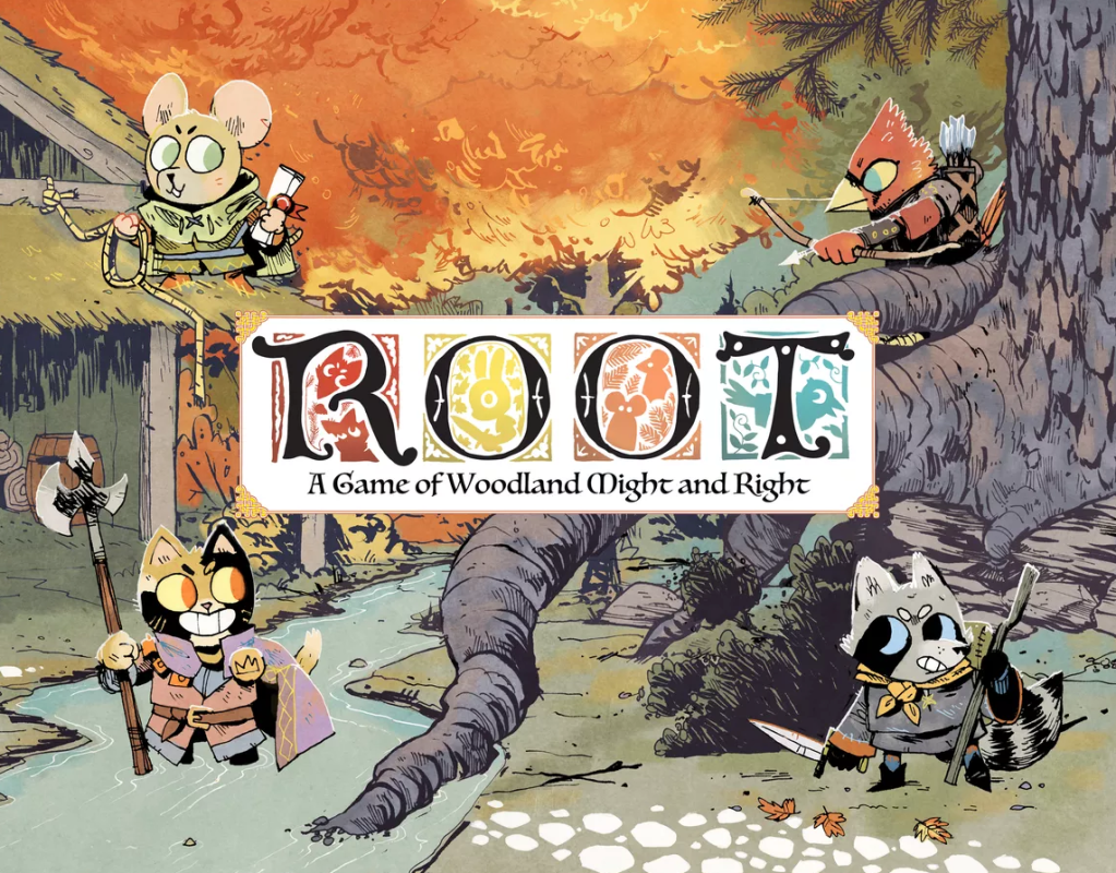
It is too hard to resist commenting on the type treatment of the cover. Ornate letters like this are common in medieval designs, but who ever thought of using it for all the letters when it’s typically just the first letter. It just works so well. The colors used in each reflect the color of one of the main 4 factions you can choose from. The art, the type, the colors, and the illustration style all set the tone for this game.