
This idea that game elements can remind players how their systems work is pulled directly from the world of Usability. The concept is that the elements of the game (components, boards, etc) contain design features that remind players of how the game’s systems work. That is to say that a game should be built using various components that are a reflection of the rules. So the design of the elements reflects the rules and reminds players of how it works. This sounds kind of obvious, but like many good design principles, it takes effort and empathy for players to excel.
A real-world example of this can be found on the lock screen for the iPhone. Note the small white bar at the bottom of the screen. This is a subtle reminder of how to use the device. Swiping up from the bottom will unlock the phone. This swipe-up mechanic is used throughout the operating system, and the white bar consistently shows up when it’s needed. It is not a “necessary” element, and users likely have this memorized nearly instantly. Nonetheless, it is a great signpost for users about how they can interact with the device.

The challenge with this design principle is to consider how our designs can elegantly reflect the rules of the game, ultimately making the game easier to play and reducing the likelihood of player mistakes.
What is Usability?
Usability is a field of work that seeks to assess the degree to which a digital interface can be used for the intended task. Some sample tasks might be to pay a bill, order a product, or find a user manual. The world of Usability has many tools, methods, heuristics, and principles that translate really to the world of board games. Digital systems are built on rules that the computer enforces, games also are built on rules the player must enforce. The fact that players must enforce the rules means that the importance of strong usability is perhaps of even greater importance. Usability in the board game world seeks to assess how effectively and efficiently players can play the game.
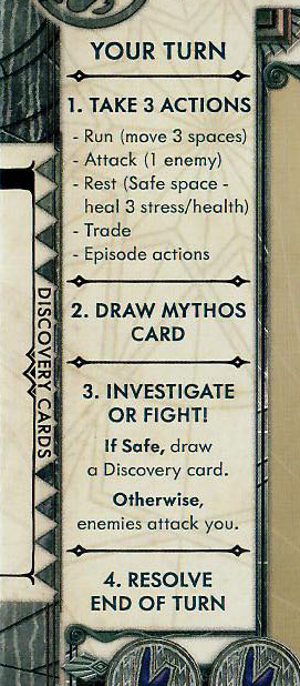
Repetition is key
The most obvious interpretation of this design principle is to simply repeat key elements across various components. A good example of this is Cthulhu Death May Die. While this game is not the most complicated, it does have a lot of separate parts to track. When new players are learning the game, it can be a lot to remember. Remembering what to do on your turn is yet another thing to keep straight. Fortunately, they ease this mental burden and remind players of how the turn works on every player board. This means every player has a quick little reference section to keep them on track. This extra detail makes the game significantly easier to teach and learn. Even as a seasoned player, I find myself following it to ensure I execute things in the proper order.
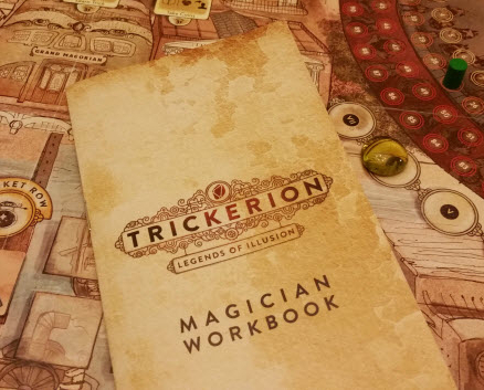
Another game that does this really well is Trickerion. In this game, players are magicians putting on shows. During the game, you get to select from a wide range of “tricks” to add to your show. Remembering all those tricks, how they work, and what they require can be overwhelming. Fortunately, they include a reference book for every player. This turns what would otherwise be a very confusing aspect of the game into a simple one.
This is such a simple way to ease the mental load on your users and to remind players of how a game works. Even in simple games, we should take every opportunity to provide this kind of support to our players. What key elements of your game and rules are you repeating in relevant contexts?
Natural boundaries
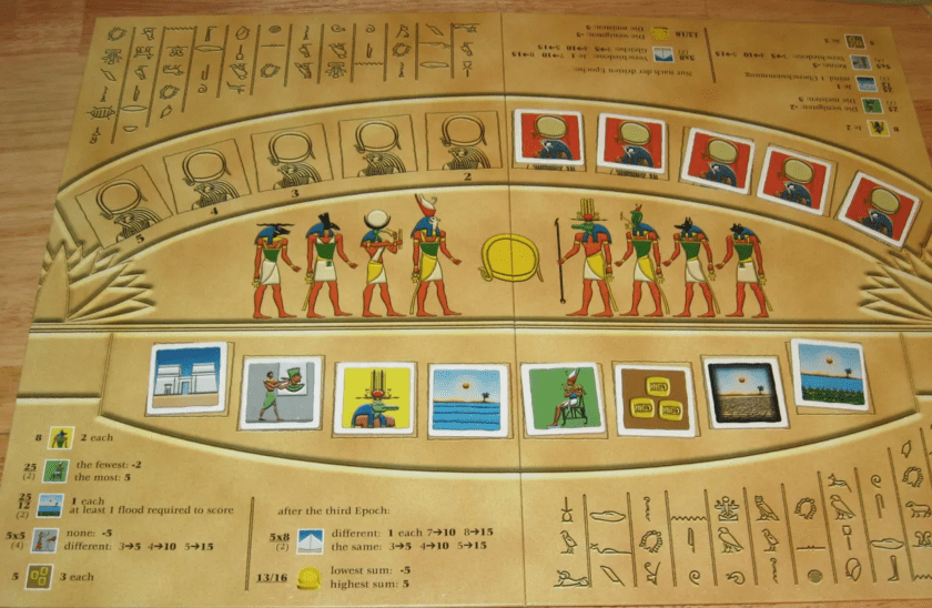
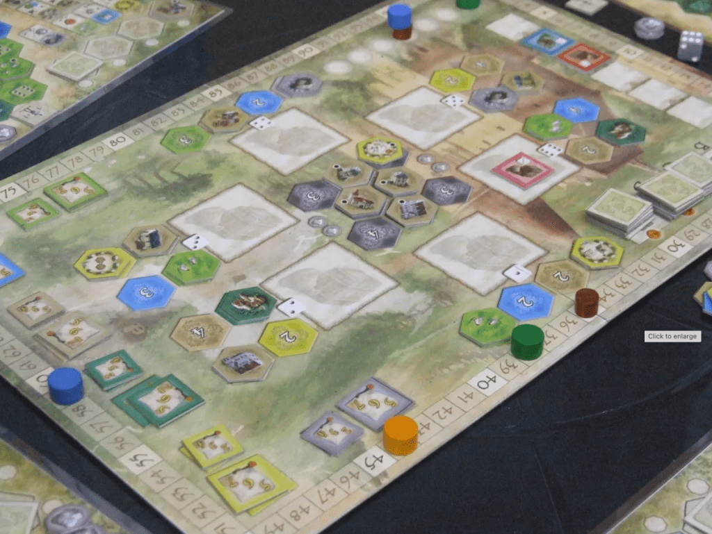
Another way to help players is to provide natural boundaries. This strategy is to provide limited space for things such that the space allowed reflects how the game is supposed to work. In Ra, for example, the board has 10 spaces for Ra tiles and 8 spaces for regular tiles. The designers could have easily omitted the board and reduced the cost of the game. But by including it and providing limited spaces for the tiles, they gently remind you how the game is played. This is especially appreciated since the two types of tiles have different limits, and both of those limits are more than you can instantly count (like 1, 2, or 3 items).
Also, note that it includes a quick reference for how scoring works on the board. In fact, it has two copies of this information, one on each side of the board. This ensures that players on either side can easily reference this key detail.
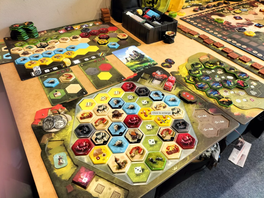
Another game where we see this simple approach at work is Castles of Burgundy. The player boards have limited space for storing tiles (bottom left corner) before you place them on your board. You can only hold 3, and there are 3 slots available. Similarly, with the goods holders at the top left, the board has limited space reflecting the limited stacks you are allowed to have. Again, the game eases players’ mental load by simply limiting the space they have to use.
The designers of this game went even further, though. They provided a turn reference in the lower right corner. Also, there is a large reference on the left to the buildings you can acquire in the game. Each of the 13 buildings does something different, and it can be really challenging to remember what they all do. This reference is key to smooth gameplay. In contrast, without this, a player might have to ask what something does and, in a way, tip off other players as to their intentions. This repetition of information and limited space all add up to a player board which is extremely helpful.
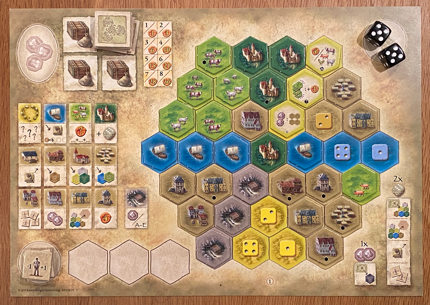
In fact, we see this concept of limiting space and reflecting rules on the main board as well. Everything has a spot, and the number of spots is clearly fixed. Again, this makes gameplay super smooth.
The Castles of Burgundy deluxe edition is absolutely gorgeous and amazing to play. Once you have played it, you will never want to go back. The only drawback, in relation to the topic being discussed here, is that they removed the helper on the player board that reminded us of what each building does. As a player, I haven’t played enough of the game to internalize all the buildings, and it’s a sorely missed reference.
Focus on the core
When in doubt, focus on the core mechanics and make sure they are presented in such a way that they support the way the game works. In the worker placement game Empires: Age of Discovery, the central board is the focus of play. It has two halves: the left half is the map to which players are sailing, and the right half contains all the “event” boxes. These boxes are the actions into which workers will be placed.
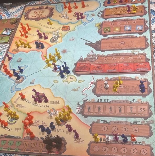
These event boxes have limited spaces and they are placed in the order they will be resolved. So the events will happen from top to bottom. All of this combined presents the core loop of the game in such a way that no memory is needed. It feels so natural that it seems almost weird to even imagine it without these elements. This simplification of things enables players to focus on other aspects of the game.
How do you know when you got it right
So how do you know when your design has achieved this? It’s really simple: when players stop asking questions about key elements of the game. Players should not have to work at remembering how everything works without any aid or support. This is especially true for any mechanics that work in ways that are counter to how they normally function in other games. In your playtests you should look for frequently confused aspects of your game. These are the things that would benefit from design elements that reinforce the way the game is supposed to work.
